When creating interfaces you often come to a point where you need to decide what your priorities are. The most obvious choice is to cater to the needs of the user. Unfortunately when doing online business sometimes this is not easy to achieve due to certain restrictions. It then becomes an economic choice.
To simplify the problem let’s say you’re designing an interface for a contact form. There are a lot of people involved in the problem and they all have their own issues they want resolved.
UX expert
Obviously the users want the form to be simple and can be filled without thinking[1]. Their ideal contact form would only consist of two or three fields. Usually this is also what you would get from the UX guys…
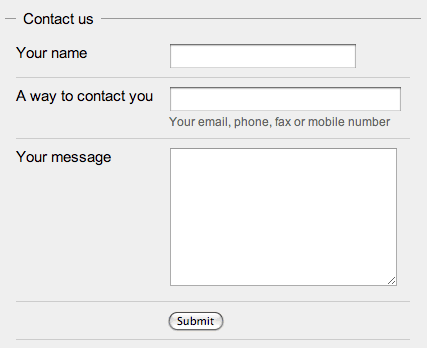
HTML example – the simple form
Sales agent
On the other side of the form you should and most probably will have somebody that will process the form, let’s say it’s a sales agent. He’s not going to like what your UX expert mocked up because it doesn’t give him enough information about the lead[2] that is asking the question. So you’d get something like this:
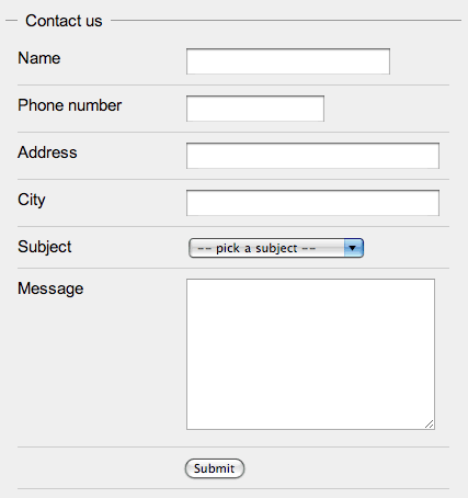
HTML example – sales agent “enhanced”
Programmer
When a programmer sees this she won’t like it at all. She would say that this contact form really gives her no way to enter the data into the customer database. There is no way she can figure out what the name and surname are, what the postal code might be if it’s there at all and she also needs more contact information since the new database requires all customers to have an email address and a mobile phone number. You’d now have a huge contact form like this:
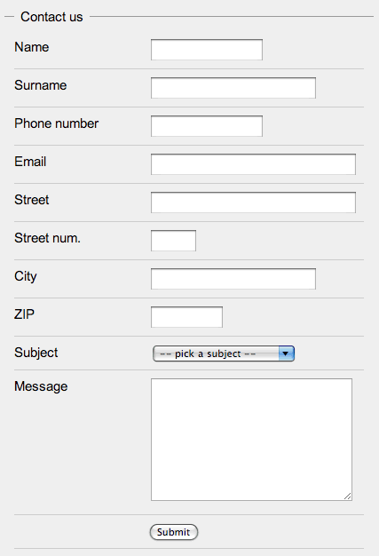
HTML example – programmer “enhanced”
Marketing
Since everybody has a stake in the website and they know better you would also get the marketing crew to add some checkboxes at the bottom of the form. They might also want some other “relevant” information about the user – at least the date of birth and the gender.
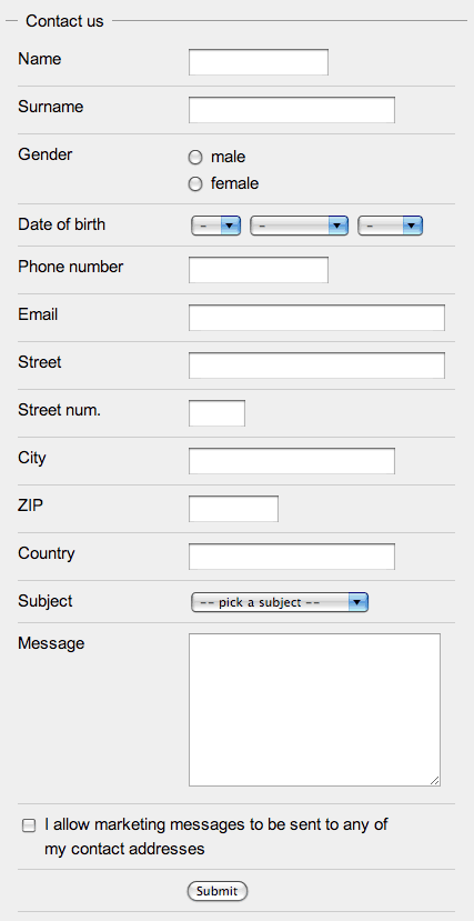
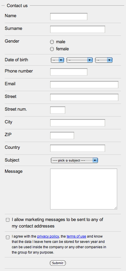
HTML example – marketing “enhanced”
Legal
At the end the legal department insists that you add one more checkbox at the end of the form that “blames” the person that submits the form for everything and anything that can possibly go wrong[3]. If you’re lucky the same checkbox will be used to convey that the data will be held for at least seven years and that it can only be uses inside “the group”.
Oh my!
So now you have a contact form with 15 fields (technically you have 18) instead of 3 which is a surplus of 400% (500%). It’s obvious that each step adds more information that is valuable to the company if it actually uses it. A really good company will know exactly how much the data is worth (lead conversion rates, programming fees, marketing material CTR + conversion, legal issues) and would probably stop at the first form. Others seem to think that this data is more valuable than the drop in the users submitting such forms due to the vast amount of information that needs to be given away.
They want it all
If you can, try to convince the client to use a simpler form. The legal department might help you there if you have any laws in your country that deal with retrieving customer information that is not directly needed to the action taken by the customer. You might be able to create two forms, display each to half of the users and test the responses.
Field length
If you really have to do it, there’s stuff you can do to help people. If you check the example forms you’ll see that the input fields have variable length – they try to match the amount of data that is needed to complete the form successfully. The reason for this is that the form seems easier to fill and doesn’t look like one of those insurance forms you need to fill when you had a car crash.
Simple input
Use various types of fields in a way that helps people fill them correctly. Don’t use a text field if there are only two options and don’t use a free form field for the input of a date. Use checkboxes, radios, drop-downs – they’re each good for something. You can also use advanced JavaScript controls like sliders, calendars or autocomplete but use them wisely.
Validate on the fly
You could also add JavaScript to validate the forms on the fly. By that I mean that while a user is writing in a field some visual cue (like a green tick and a red x) would tell the user the field has been correctly filled. A lot of discouragement with long forms comes from the fear of having to refill the form if a single piece of information is input invalidly.
If you want to know more about forms check out the article Web Application Form Design by Luke Wroblewski or wait for his book Web Form Design Best Practices
- Check Don’t Make Me Think: A Common Sense Approach to Web Usability, 2nd Edition by Steve Krug. back
- Sales people don’t interact with people, users or any other lifeform – they deal with leads. Read more about leads in Managing Sales Leads: Turning Cold Prospects into Hot Customers by James Obermayer back
- If it can go wrong, it will – Murphy’s Law back
[…] Messing up the interface Great example about how a simple web form can become massive the more company departments are involved. (tags: UX usability interface ia forms) […]
[…] Today’s Distractions 10Jan2008 Filed under: Daily Links Author: admin outbreak » Messing up the interfaceHow web forms can go very, very wrong.tags: messingup bad ux interface usability forms […]
[…] Коллективная разработка интерфейсов (перевод) Оригинал статьи […]
[…] Messing up the interface […]
[…] Website Registrierungen richtig gestaltenDie Firmenwebsite ist das Aushängeschild eines Unternehmens im Internet. Die Registrierungs- bzw. Anmeldeseite ist nach der Homepage die wichtigste Seite des Webauftritts, weil hier die Konsumenten und User der Seite aktiv werden sollen. Gerade diese Seite wird von vielen Unternehmen sehr vernachlässigt. Bei friedcellcollective.net gibt es einen tollen Artikel zu diesem Thema. Es wird beschrieben, wie durch den Einfluss verschiedener Interessensgruppen eine eigentlich simple Registrierung zu einem komplizierten Formular mit unzähligen Eingabefeldern wird. Artikel: Messing up the interface […]
[…] Top content is still This page contains both secure and nonsecure items, Messing up the interface coming in at a distant second with merely a third of the visits. […]
[…] want is at least a name and a way to contact them (the others in your company might want more, but that’s a different storypost). The registration form is somewhat similar in the way that you can make it really simple by just […]