 Image via Wikipedia While shopping today it struck me that you can also choose your clientele with the music you play in a shop. Or inadvertently repulse shoppers if an aggressive young shop assistant plays music that customers don’t like. This made me think that I’m not in the demographic of Jack & Jones Jones and that I’m welcome in the shop for wedding gifts. I’m getting old obviously.
Archive for August, 2008
Lure me in with the music
Friday, August 29th, 2008Reading JavaScript
Thursday, August 28th, 2008 Image by Edd Dumbill via Flickr I’ve just received two books about JavaScript that will keep me entertained over the weekend. The first one is from the father of JSON, JSLint and JSmin Douglas Crockford, whose series of lectures on JavaScript is really a great video introduction from beginner to intermediate and sometimes even pro level and is called Javascript: The Good Parts. I haven’t even tried to look at it because I’m scared I’ll start reading it and won’t get any sleep.
The other one is from the new kid on the block, the jQuery author and JavaScripter extraordinaire John Resig, called Pro Javascript Techniques. Reading the jQuery code is always one of the most fascinating parts of work, so I just had to order it.
I’ll try to post a review of both of them as soon as possible, but it might be later than I hope since I have a lot to do in these coming weeks.
Discovering Greasemonkey again
Friday, August 15th, 2008 Image via Wikipedia I’ve been rediscovering the joy of Greasemonkey scripts lately. For those who don’t know, Greasemonkey is one of the best extensions for Firefox ever made (the other being Zemanta of course:) that allows you to run JavaScripts on specified pages. This doesn’t really mean much to the non-technical crowd, but to us geeks this means you can do almost whatever you want with the page. As I make more and more of these I decided to share them here.
For my Slovenian readers
- Finance unfixed is a script that will unfix the header of finance.si. This means the header will scroll and you’ll get more space to read the article.
- RTVSlo OI is a script that will remove the header from the OI page on rtvslo.si again leaving you with more real estate for reading.
- Delo is a script that will help your eyes when reading delo.si news site since it’s small default line-height might make them hurt.
Developers
- JSLint highlighter will help you read the JSLint results. If you write JavaScript and don’t know what JSLint is you should go check!
How to work it
Well first you have to have Greasemonkey installed. After that installing a user script should be as simple as a click of a link. When a script activates you’ll see a little green box that will say ‘Greased’ in the top right corner. Clicking it will toggle the script – either it’s on and active (green) or off and the page looks as it would in the first place (red). You can also toggle the script with alt+g.
Related articles by Zemanta
- Make Google Reader Widescreen-Friendly [Featured Greasemonkey User Script]
- Get More Work Space with Writing Room 4 Google Documents [Featured Greasemonkey User Script]
- Play Chickenfoot With the DOMinoes of the Web
- Roll your own Firefox scripts with Chickenfoot
- iGoogle Header Remover Improves Screen Real Estate [Featured Greasemonkey User Script]
- Get Download Links to High Quality YouTube Vids [Featured Greasemonkey User Script]
New version of Zemanta is out
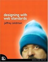
Thursday, August 14th, 2008 Book cover via AmazonWe released a new version a few days ago.
It’s mostly a bugfix release on the front-end part while there are quite a few fascinating developments on the back end. The first one is that we now suggest CrunchBase links to companies and people and we also suggest images to go with that. So if you’re writing about a start-up, a funding round, investors or anything else that is present in CrunchBase you’re likely to get better suggestions.
We’ve also added Amazon book covers for books that we find in Amazon (like Designing With Web Standards by Jeffrey Zeldman or Transcending CSS by Andy Clarke).
The biggest news is that we were able to transfer the Zemanta experience to Windows Live Writer which is our first desktop application integration. I hope this brings joy to the users of Live Writer. Being the first desktop application integration it didn’t go without glitches but I hope we fixed all the bugs, even those that were found by the first users.
We also have a new home page for everybody who doesn’t yet know what we do. If you don’t have our extension/plugin installed and you’re a blogger give it a go – you won’t regret it.
Top 10 Usability Lows Of Mac OS
Wednesday, August 13th, 2008 Image via Wikipedia I’ve been using a Mac since I started my job at Zemanta. I wanted to have a Mac because I want to be able to use Windows and Mac OS and change from one to the other seamlessly. When I saw Top 10 Usability Highs Of Mac OS on Smashing Magazine and read the first point I figured that I don’t agree with the list. Strongly.
-
Consistency
There’s probably a lot of stuff that acts completely consistently but I think we can find this in all operating systems. What I really hate is that moving through text with the keyboard is really utterly inconsistent on a Mac. My Macbook keyboard is missing buttons that are very valuable to me when coding – Page down, Page up, Home, End. There are hints of these with Fn + arrow keys but in every application these act differently. And this all changes when using the wireless keyboard. The same goes for jumping over words / phrases…
-
Intuitivity
I didn’t get the install. Why would I have to drag something to Applications if I already decided to install it? It’s like a waiter coming back and rechecking your order. And it’s not really that intuitive – it took me a few installs (to get one where it was neatly explained with a “drag the app to the Applications to install”) to get it.
-
Effective and appropriate metaphors
I could agree with this but then again I have the desktop set to two screens and when on the top screen and an application is positioned so that it should appear on the bottom screen it doesn’t. Which isn’t really consistent. After a few tries I figured out that you can actually move stuff around if you persist long enough. Made me think though.
-
Informative error reporting on-demand
If this was true it would tell me that my wireless connection went down and I wouldn’t have to recheck it all the time. And it goes down often even though the other side is a Time Capsule which should be totally compiant.
-
Hiding the technical details
Great for novice users. But once in a while you want to get to know something more about your computer. And then you have to download 1GB of developer tools to get a simple compiler. I know, I’m not the target audience, I should really have a Linux instalation, right?
-
Fitts’ Law
I’m quite sure that I do a lot more mouse miles on a Mac than on a PC. There’s a simple reason — when you have two screens you have to decide where your menu bar will be. And if you’re using an application on the other screen you’re bound to have to make a trip every time you don’t know a keyboard shortcut. And you don’t if you’re a rookie user like me. I think this was a neat idea in the age of small single screens but times have changed – need to move on Apple…
-
User input feedback
Having no OK and using auto-save and auto-apply where possible is great. If it really would be used this way consistently. Unfortunately some situations aren’t really the auto-save type and this makes you think – will the next click already apply or will it just change it and I can undo everything I made with a simple click on the Cancel button?
-
User support and navigation
This really is a great feature but it’s not a plus anymore. Vista has the same feature implemented and if we only look at it from a view of a user the only difference is that Vista’s is a bit slower. On the other hand it finds more stuff.
-
Workflow
This has more to do with the way you use an OS then the features of Mac OS. The only difference is that Mac OS actively discourages maximizing apps and has more features that help you find lost windows. The difference is getting smaller though.
-
Even kernel panic looks nice!
Haven’t ever seen a kernel panic yet. That doesn’t mean my Mac has never crashed, it only means I never saw a the panic screen. It crashed with a black screen, auto restart or just freezing.
I agree that there are many features that stand out on the Mac OS X but it also has a lot of stuff that is not as good as it could be. A nice example is the Finder that looks the same when opened as an application or when used as the browse window in another application. The only problem is that in the second case all the control-click options are gone and if you try to open a file and remember you have to update your repository first you have to go to another window and update it there.
![Reblog this post [with Zemanta]](http://img.zemanta.com/reblog_c.png?x-id=c18a4440-9f40-44a2-8ddc-03b1846d8269)
![Reblog this post [with Zemanta]](http://img.zemanta.com/reblog_c.png?x-id=7142569e-3eb2-4119-9c49-281e7b9c7f0f)
![Reblog this post [with Zemanta]](http://img.zemanta.com/reblog_c.png?x-id=55ad7c1c-ac13-4b05-a456-b330738d63cd)
![Reblog this post [with Zemanta]](http://img.zemanta.com/reblog_c.png?x-id=86ed5c9b-b1a4-4c4f-ad28-133c1d417097)
