Archive for the ‘companies’ Category

Don’t make an ASS of U and ME

Friday, February 20th, 2009

What’s wrong with the following line of code (from WordPress 2.6.5, common.js)?

jQuery(function(){jQuery('#media-buttons a').tTips();});

What guarantees do you have that by the time the internal function executes the global jQuery will still be the one you expect it to be or that it will have the tTips plug-in you attached a few lines earlier? Nothing. You just ASSUME it will be. You didn’t put it there, so you can be sure that nobody will. Right.

jQuery developers knew this might be a problem so jQuery will pass a reference to the itself as an argument when triggering this event:

jQuery(function($){$('#media-buttons a').tTips();});

This would work and wouldn’t break. And it would make your platform a bit more hackable.

jQuery.readyOrDone

Thursday, February 19th, 2009

There’s a really small probability that someone might need something like this but I did and I’d like to share it.

At Zemanta we have a few different ways of loading our scripts and we cannot always control when they do. The Firefox extension will load the scripts on DOM ready, WordPress plugin will load them somewhere in the middle of the HTML, Drupal and MovableType plugins will load them in the head and IE extension will load them sometime while loading the page.

This all means that we have to delay some of our code execution to when DOM is ready and scripts are loaded. Which is where the problem kicks in.

jQuery has this nice way of doing this with $(document).ready(fn) or short $(fn) which waits until the document is ready and executes the passed fn function. If the document is ready it will execute the function immediately. Our issue lies in what “document is ready” means to jQuery – it means different thing in different browsers.

In browsers that support DOMContentLoaded (Firefox, Webkit, Opera – let’s call them modern browsers) “document is ready” means that either DOMContentLoaded event fired on the document or the load event fired on its window. On IE “document is ready” means that either onreadystatechange fired with readyState === 'complete' on the document or document.documentElement.doScroll("left") is successful (Diego Perini hack). To make this short – if you load jQuery after all the events fired in modern browsers jQuery will never know that the document is ready.

To get around this (we really don’t like having our own hacked version of jQuery) I wrote this little plugin:

(function ($) {
$.readyOrDone = function (fn) {
	var s = document.readyState;
	if (s === 'complete') {
		$.ready();
	}
	$(fn);
};
})(jQuery);

As you can see this will check if document is in a “complete” state and fire the ready method on jQuery which usually fires when DOM is ready – if it fired before it will do nothing. It will then add the function to the ready queue which also has this nice feature of firing immediately if DOM is ready.

All you have to do is change your $(fn) calls to $.readyOrDone(fn) and you have a bulletproof solution for executing functions when DOM is ready even if jQuery was late to the party and has no idea if the document is really ready.

Update: Filed a bug and hoping for the best.

Update 2: I found out that not all browsers provide the readyState property – Firefox on Ubuntu for example. Devised a new version that tries to smartly handle such cases:

(function ($) {
	var time = setTimeout(function () {}, 0),
		lastelm = null;
	$.readyOrDone = function (fn) {
		var s = document.readyState, getLast = function () {
			var elms = document.getElementsByTagName('*');
			return elms[elms.length - 1];
		};
		if (s === 'complete') {
			$.ready();
		} else if (typeof s === 'undefined') {
			lastelm = getLast();
			clearTimeout(time);
			time = setTimeout(function () {
				if (getLast() === lastelm && typeof document.readyState === 'undefined') {
					 $.ready();
				}
			}, 1000);
		}
		$(fn);
	};
})($);
Reblog this post [with Zemanta]

Getting into the graph

Sunday, January 11th, 2009

Designing forms online is a hard job. What you need to do is find the right balance between the consumer experience which is generally worse as the number of fields grows and the amount of content you or your employers want to get from the user in a single form. With this you’re defining the conversion rate of a form – less fields will, ceteris paribus, give you a higher conversion rate – which means that you should strive to have less fields in a form (although recently I saw an argument on twitter that you want for people to put some effort into forms to avoid registration from people who will never use your service1). Having many fields in a form has two major effects – users cannot easily scan the form to see if they’re actually willing to give away all the information that you want and they don’t want the form to take a lot of time. Since you sometimes can’t lower the number of required fields you can try to lesser the pain of filling them – by auto pre-filling them.

This is especially true of contact/feedback and registration forms. On contact forms the only thing consumers want to give is the message, on the other hand what you want is at least a name and a way to contact them (the others in your company might want more, but that’s a different storypost). The registration form is somewhat similar in the way that you can make it really simple by just using email and password fields but then again it’s nice if you have a way of addressing your users other than an email address and if your application is at least a bit local you also want their location.

The other side of the story is obviously that consumers don’t want to fill the same forms all the time. As time passes they’re minds are saying “Not again…” which is not that far enough from “Why can’t they get it from some place I already use”.

Into the graph

There have been a lot of attempts at solving this issue of repetitive entering of same data. There’s a way to do it with OpenID, which unfortunately isn’t ready for mass use since not many people use it. Other possibilities are public APIs of numerous services that allow you to get at least some user information if you have some data about them.

One of these APIs is Flickr‘s as it allows access to user information if you have the user’s email through flickr.people.findByEmail and then flickr.people.getInfo as is neatly demostrated by huffduffer which uses it to retrieve your Flickr avatar.

What you have now is the user’s name, “preferred” username, location and avatar (which you might have had already if the user is registered with gravatar).

The graph

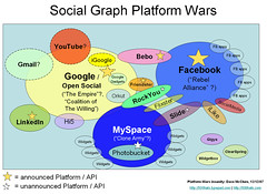
Social Graph Platform Wars
Image by davemc500hats via Flickr

The other place where you can get decent information about the user is Google’s SocialGraph API. With it you get lots of services from which you can get all kinds of public information about a user. The problem with this API is that you first need a relevant entry point which must be a URL that the user owns. This can be a Flickr user URL (that you have if you successfully completed the previous step) but these don’t always produce very good results.

What seems to produce better results are twitter URLs – the only problem wasis how to get one. An easy way to get the users twitter URL is demonstrated in a blog post by Chris Heilmann. This will get you all the information you get from Flickr for all the users that are currently logged in to their twitter account. Seems that this is not possible anymore!

If you’re still not getting anything you can still ask a user for a URL – be it their blog or any social network service account. Or you can let her log in using other services that will give you a good starting point, like Facebook Connect or OpenID.

Data from the graph

What SocialGraph gives you is a list of services the user is registered with. You can also get their list of friends – if any of them are also users of your service you can suggest they also connect on your service. You might also get to know whether they use OpenID and suggest them that they use that login to log into your service too. Or you might be able to figure out what their blogs are – especially when they’re claimed on Technorati.

This information can also help you get in touch with your users as you can automatically contact them on services where you also have an account, like Facebook, twitter, friendfeed and others.

The thing is that once you have all this information you should be able to get all the public information the user has exposed on any of these services. And you can use this information to help the user by pre-filling forms or use it in other ways that a user might find helpful, but not spooky.

What you shouldn’t do is use this information in ways that might scare the user. For example if you can get the birth date from any of the services, don’t hide the fact that you did – offer a form to fill the date and prefill it. This way the user won’t be spooked if you send them a happy birthday note or you greet them with a happy birthday note.

This form should get your Twitter data and then get some of your services via Google’s SocialGraph. It’s all nicely wrapped in an hCard.

  1. Sorry I forgot your name as I’m not yet used to bookmarking twitter statuses. back
Reblog this post [with Zemanta]

Testing JavaScript in IE

Thursday, September 18th, 2008
Are libraries guns in the hands of children?

Image by Friedcell via Flickr

As nowadays less and less development goes on in Internet Explorer and the versions that are currently available and widely used have some quirks — to be fair they are by the book and others aren’t — I’m starting this post to have a list of stuff that you need to keep in mind if you don’t want problems when testing in IE.

  1. Trailing comma in object literals

    This is very common in multiline object definitions. someObject = {a:17,b:19,}; looks wrong but when you have a newline after everything it’s hard to find. Firefox lets it be, IE breaks silently. This one is easy to catch with JSLint.

  2. String is not an array

    Even though many languages treat it this way. Using str[i].charCodeAt() breaks while str.charCodeAt(i) doesn’t.

  3. Element ownership matters.

    This means that you have to take care when creating elements and attaching them to different documents. If you’re using jQuery beware – jQuery(someElement).append(someHtml); is ok since it will check what the owner document is but jQuery(someHtml).appendTo(someElement); might break if execution and someElement are in different documents. You can use jQuery(someHtml, someElement.ownerDocument).appendTo(someElement); though.

What I do before testing in any browser other than Firefox (Opera is sometimes even stricter) is to check with JSLint how damaged the code is. It will catch all the weirdly written code that might break a browser. And it catches that trailing comma I mentioned.

I’m quite sure the list should be longer but these are the things I encountered in the last few days. When I find more I’ll add them to the list. If you know any that are not on the list add a comment.

Reblog this post [with Zemanta]

New version of Zemanta is out

Thursday, August 14th, 2008

Book cover of Designing With Web StandardsBook cover via AmazonWe released a new version a few days ago.

It’s mostly a bugfix release on the front-end part while there are quite a few fascinating developments on the back end. The first one is that we now suggest CrunchBase links to companies and people and we also suggest images to go with that. So if you’re writing about a start-up, a funding round, investors or anything else that is present in CrunchBase you’re likely to get better suggestions.

We’ve also added Amazon book covers for books that we find in Amazon (like Designing With Web Standards by Jeffrey Zeldman or Transcending CSS by Andy Clarke).

The biggest news is that we were able to transfer the Zemanta experience to Windows Live Writer which is our first desktop application integration. I hope this brings joy to the users of Live Writer. Being the first desktop application integration it didn’t go without glitches but I hope we fixed all the bugs, even those that were found by the first users.

We also have a new home page for everybody who doesn’t yet know what we do. If you don’t have our extension/plugin installed and you’re a blogger give it a go – you won’t regret it.

Reblog this post [with Zemanta]

Top 10 Usability Lows Of Mac OS

Wednesday, August 13th, 2008

White MacBook laptopImage via Wikipedia I’ve been using a Mac since I started my job at Zemanta. I wanted to have a Mac because I want to be able to use Windows and Mac OS and change from one to the other seamlessly. When I saw Top 10 Usability Highs Of Mac OS on Smashing Magazine and read the first point I figured that I don’t agree with the list. Strongly.

  1. Consistency

    There’s probably a lot of stuff that acts completely consistently but I think we can find this in all operating systems. What I really hate is that moving through text with the keyboard is really utterly inconsistent on a Mac. My Macbook keyboard is missing buttons that are very valuable to me when coding – Page down, Page up, Home, End. There are hints of these with Fn + arrow keys but in every application these act differently. And this all changes when using the wireless keyboard. The same goes for jumping over words / phrases…

  2. Intuitivity

    I didn’t get the install. Why would I have to drag something to Applications if I already decided to install it? It’s like a waiter coming back and rechecking your order. And it’s not really that intuitive – it took me a few installs (to get one where it was neatly explained with a “drag the app to the Applications to install”) to get it.

  3. Effective and appropriate metaphors

    I could agree with this but then again I have the desktop set to two screens and when on the top screen and an application is positioned so that it should appear on the bottom screen it doesn’t. Which isn’t really consistent. After a few tries I figured out that you can actually move stuff around if you persist long enough. Made me think though.

  4. Informative error reporting on-demand

    If this was true it would tell me that my wireless connection went down and I wouldn’t have to recheck it all the time. And it goes down often even though the other side is a Time Capsule which should be totally compiant.

  5. Hiding the technical details

    Great for novice users. But once in a while you want to get to know something more about your computer. And then you have to download 1GB of developer tools to get a simple compiler. I know, I’m not the target audience, I should really have a Linux instalation, right?

  6. Fitts’ Law

    I’m quite sure that I do a lot more mouse miles on a Mac than on a PC. There’s a simple reason — when you have two screens you have to decide where your menu bar will be. And if you’re using an application on the other screen you’re bound to have to make a trip every time you don’t know a keyboard shortcut. And you don’t if you’re a rookie user like me. I think this was a neat idea in the age of small single screens but times have changed – need to move on Apple

  7. User input feedback

    Having no OK and using auto-save and auto-apply where possible is great. If it really would be used this way consistently. Unfortunately some situations aren’t really the auto-save type and this makes you think – will the next click already apply or will it just change it and I can undo everything I made with a simple click on the Cancel button?

  8. User support and navigation

    This really is a great feature but it’s not a plus anymore. Vista has the same feature implemented and if we only look at it from a view of a user the only difference is that Vista’s is a bit slower. On the other hand it finds more stuff.

  9. Workflow

    This has more to do with the way you use an OS then the features of Mac OS. The only difference is that Mac OS actively discourages maximizing apps and has more features that help you find lost windows. The difference is getting smaller though.

  10. Even kernel panic looks nice!

    Haven’t ever seen a kernel panic yet. That doesn’t mean my Mac has never crashed, it only means I never saw a the panic screen. It crashed with a black screen, auto restart or just freezing.

I agree that there are many features that stand out on the Mac OS X but it also has a lot of stuff that is not as good as it could be. A nice example is the Finder that looks the same when opened as an application or when used as the browse window in another application. The only problem is that in the second case all the control-click options are gone and if you try to open a file and remember you have to update your repository first you have to go to another window and update it there.

Reblog this post