Archive for the ‘events’ Category

Futura’s 10th party

Friday, May 23rd, 2008

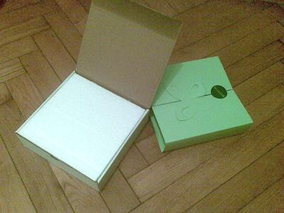
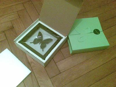
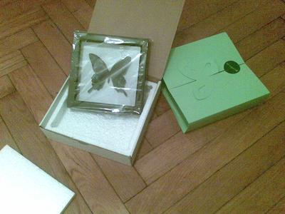
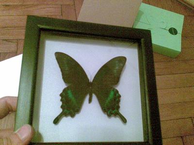
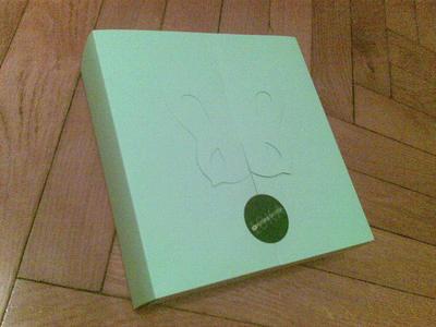
Yesterday I was a guest at the Futura’s 10th agency of the year award party. I won’t go into the details of the party, I’ll focus on the gift that I received when leaving. Posting the pictures of unboxing below.

The box
It’s out
Packaged
Butterfly?
More foam
I hope it wasn’t alive
Either it was or it’s a good fake

I really hope this butterfly wasn’t alive one day. I really don’t think it would fit well into the whole “eco” scheme.

Start–up night #2

Wednesday, May 21st, 2008

rezerviraj.si

(translates into booking.si)

A start–up that started as a service for booking tables in restaurants and figured out that Slovenian market isn’t ready for this yet. The problem aren’t the users but the suppliers — the dining industry seems to be governed by older owners and internet and computers are a rarity. This means they need to “relocate” to bookings in other areas.

What fascinated me the most was that they think that ideas are cheap and you need to share them as much as you can — you’ll be getting valuable comments from everybody you share the idea with. I completely agree with this but I don’t entirely agree with another point they made — that you need to have a business plan done to start. I agree that it’s important to think about all this but would put the passion in front of making a well styled document.

All in all an interesting talk about how to start a web service with some really refreshing comments.

investoo.net

The passion for investing in stock, funds and other financial instruments in the Balkan is the basis for this start–up. The team consists of two people that are passionate about this topic and also passionate about web 2.0 services. They spent approximately 16 person–months working until now and expect to invest 8 more until launch in a few months — they’re looking for developers!

The reasons to start a new financial portal seems pretty straight forward — there is no good alternative and all the competition is from web 1.0 or older. It’s a great thing when you find out that you’re passionate about something that is not really present on the market.

darilniboni.com

(translates to giftcoupons.com)

When asked whether they ever had problems with gift buying almost everybody in the room said yes. A much smaller number bought a gift coupon. This start–up thinks the number is big enough and they started a web service that sells gift coupons for different stores. When looking back they now know that they spent way too much time on stuff that isn’t really all that important — business cards, legal issues, marketing materials,… I’m not saying these aren’t important and neither are they — but they need to be done as quickly as possible so they don’t come between you and the goal. And the goal is building and growing a successful business.

Another problem they mentioned is the huge number of ideas that lead to scope creep. This is usually also my problem but I think I rooted it out successfully — what I do is talk about ideas and write them all down. This means I don’t need to think about them anymore. I heard something similar in an Indiana Jones movie the other day.

podarimo.si

(translates to giveaway.si)

The most famous start–up today with press coverage on the main Slovenian TV and radio stations. The team consists of two people — one responsible for the technical side and the other for PR. The final design was set on the 8th March 2007 and the page was launched a week later. A lesson they learned the hard way was that you need to buy the domains early on — as Murphy goes you’ll lose it the day you want to buy it.

Communication is key — you can actually get free stuff if you ask. You’ve got nothing to loose anyway. Because they went for a charitable cause they got a lot of free PR. And now people are passing the link on to those that want to give something away which is probably the ultimate goal of every web service. Having a fan club can be very good for your business…

You also need to think about how to handle the peaks that will come when you succeed. If you don’t your service will die when you have the link on the front page of TechCrunch. Or in the case of local service on the local TV station.
Web Typography Sucks

Thursday, May 15th, 2008

The Elements of Typographic StyleImage via WikipediaThat’s the title of the talk by the first foreign speaker1 at Spletne urice — Richard Rutter from Clearleft, who’s really a great guy and a great speaker.

Web Typography is one of the topics I really care about and I think it’s an issue that iswas a bit overlooked in our local community. After my talk last year about fonts and possible ways to use / embed them I am happy that we got Richard to come to Slovenia to talk about this — who could be better than the author of The Elements of Typographic Style Applied to the Web.

The talk went great2 (Cyberpipe filled up after the first few minutes) and it was followed by a good Q&A session. In the session I mentioned that a font foundry released a font that is free for use on the web and thus free for embeding — the foundry is called FDI fonts.info — you can read their press release or download Graublau Sans Web and Logotypia Pro for free. After the talk we went for a beer in Metropol (just above Cyberpipe) and then another one later on in the city center.

All in all it was great having Richard here and I guess he liked it too. I hope he’ll put in a good word for us and we’ll get even more foreign speakers to come to Ljubljana and share their in–depth knowledge of specific areas of webdesign and development3.

I would also like to thank our silent sponsor Parsek Interactive that took care of the air fare and the hotel bill and also Zemanta that shared their work space with Richard today4.

  1. Technically Daniel P. Fischer was the first, but he gave his talk as part of the HAIP festival and his stay and talk was organized by the Cyberpipe crew. So what I’m trying to say is that Richard was the first speaker I organized by myself. back
  2. If you missed the talk the slides are here and the video should be online in a couple of weeks. back
  3. Any volunteer speakers? Any suggestions? Sponsors maybe? back
  4. Did you notice that I tried to punctuate with the correct apostophes, en dashes, em dashes, elipses’… It’s not that easy — somebody should create a WordPress plugin for this. back
Zemified

FOWD review

Sunday, April 20th, 2008

ChattingImage by adactio via FlickrSo I’ve come home from London where I visited the Future of Web Design conference. I decided to only visit the conference on Thursday, not the workshops on Friday. The reason for this is that I like to learn stuff by myself or by talking to other people – I’m not into group therapy.

This was my first Carsonified conference, the makers of web apps which help you send large files and match advertisers and newsletters and also a resource for web developers, designers and entrepreneurs.

Their conferences happen often and I’ve thought of going to a few of them before but I’ve usually been too busy. I decided to go this year and I’m not sorry I did – even though I heard some harsh comments about the program. I liked the conference – most of the talks were thought provoking enough even when what I already knew most of what the speakers presented. I must agree with those that complained over the sponsored talks – the first one was weird to say the least and the second one seemed more pristine (or I was just in a more naive mood).

The venue was ok – it was big enough for the 850 crowd but the lounge was way to small. The food was lacking, another problem being drinks – fortunately one of the sponsors was kind enough to give out water at the beginning and me being smart enough to take one then since it ran out even before the conference started. I was surprised at how the breaks were set – I would have expected them to be shorter and the lunch break to be longer – there was a huge crowd that had to find something to eat and be back in 30 minutes.

The pre-party sponsored by Media Temple was held in a pub with an open bar. It was great, but I was tired as hell so I left quite early. The after party was a completely different story – the free drinks ran out in the first 40 minutes, the club was way too small and the music was way too loud. I ran into Andy Clarke and invited him to Slovenia to speak at Spletne urice – I hope he’ll have time to come this year and share his views on the future of the web.

All-in-all it was a good conference with a few shortcomings and it’s well worth buying the conference in a box package.

I’ll also be speaking about the conference this Wednesday at Spletne urice with some of the other Slovenian attendees.

Zemified

FOWD presentations, part 3

Thursday, April 17th, 2008

The last batch of presentations:

Unconventional ways to promote your site

Paul Farnell

A really amazing talk that started out by saying that SEO, AdWords are conventional and talked about unconventional means of promoting your site / service / app. The first point being satellites – small freebish stuff that doesn’t need much work but are a constant drivers of visitors to your main site / service (examples: Litmus CSSVista, 37signals Ta-da Lists). Another valid proposition is to join social networks and forums that cover similar stuff your app does – a link in your signature can also make a lot of visitors. A big driver is the word “free” but since you can’t have only free stuff the guys at Litmus decided to launch every payable product/service with a short period when it’s free to use – they’re counting on the buzz since you can test the app without lock-in. This is a different approach to giving 30 days of free service when you register since it creates a bigger buzz when you launch. The main lesson is that you need to be human – you need to show enthusiasm (toward technology and your product) in order to build trust which will in turn give you access to passionate users (if they trust that you can solve their problem they will ask).

Evolving the User Experience

Daniel Burka

There are numerous ways of designing stuff – building complex stuff or building a modular structure. The first will give you a great solution if you know most of the parameters and the second will give you building blocks so you can build whatever you want. The thing is that even the first solution gives you possibilities to change – a nice example are older buildings that are now used for something they weren’t designed for. The web is also a good place to follow the users – what they’re doing is a direction for design and feature list and there is no excuse not to listen to this important feedback (you can also do this in architecture for setting up paths – set them where people walk, cause that’s the user pattern that evolved with the use of the park). Subtraction is also iteration – don’t be afraid to add, remove or just change small thing in the design – if you are you can always only deploy such new features to a limited number of users to see whether it works or not. Fixing things doesn’t necessarily mean starting from scratch – realigning the design is much more difficult but will land better with the users. There’s also no need to innovate to do something better – stuff that is out there works and you need to find out how it can work in your site. You also need to think of the iteration process – how often you’ll realign the page and how fast you can deploy and roll-out changes.

Zemantified

FOWD presentations, part 2

Thursday, April 17th, 2008

I was surprised at how big this conference is – according to a JavaScript that counts rows in the attendee list there’s 879 people in this hall.

Getting your designs approved: 12 Simple Rules

by Larissa Meek

A representative of the big agencies world (works for AgencyNet) Larissa delivered a nice checklist of what you need to think about when working with a big client. What I missed is possible solutions for this but this would probably require a dialogue and a day or two. The thing is, and it seems to be the theme here, that everything depends – on the projects, the client, the team,…

Photoshop battle

Jon Hicks, Elliot Jay Stocks, Jina Bolton, Hannah Donovan with commentary from Andy Clarke

The contenders were split into two teams – men and women. Women started the Photoshop battle and while the guys were chatting created the beginning of the final picture. After two iterations a weird image of Andy Clarke was the result. The chat was interesting and the result of the battle was hilarious.

Print and the web

Elliot Jay Stocks

A nice session about how web design relates to other stuff we know – print design, drama – and what the main meaning of design is. While print design has different limitation and different dynamics it’s a valid source of inspiration and technique copying for web designers – it should be the only one though.

From Design to Deployment

by Jon Hicks

Displaying how to change a design into a deployed page on the case of Cheesophile we got a few great tips from Jon. A technique I haven’t used before but I will try from now on is basic.css that is loaded in all browsers and sets the content for older browsers. What you do here is only add some color, maybe try to size fonts and of course add the background image that notifies the user that they’re using an older browser. An interesting proposition is also to allow users to tab to the “skip to …” menu – even though it’s hidden you could show it when people use tab to navigate through the page using the :focus modified in CSS. Another neat idea is to use some sort of framework for development and when you’re finished just go and set specific CSS rules to semantic class names.

Another thing Jon mentioned is how different font sizes are for different fonts – I had this problem a while ago when I was first starting to use the Vista ClearType fonts that are much smaller than your regular Arial font. So I created a script that would determine what font a certain tag is using and add a class name to that element so you could target that font directly. It’s a JavaScript enhancement so it’s not a perfect solution but it will help 90% of the people using XP without the new fonts. The thing is I never really finished that script so it’s not online yet – I’ll find it when I come back and put it online so the typophiles can use it to give a better experience with different typefaces on different platforms.