Web Typography Sucks

May 15th, 2008

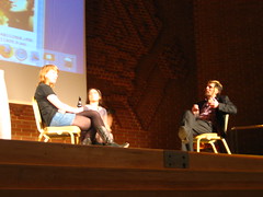
The Elements of Typographic StyleImage via WikipediaThat’s the title of the talk by the first foreign speaker1 at Spletne urice — Richard Rutter from Clearleft, who’s really a great guy and a great speaker.

Web Typography is one of the topics I really care about and I think it’s an issue that iswas a bit overlooked in our local community. After my talk last year about fonts and possible ways to use / embed them I am happy that we got Richard to come to Slovenia to talk about this — who could be better than the author of The Elements of Typographic Style Applied to the Web.

The talk went great2 (Cyberpipe filled up after the first few minutes) and it was followed by a good Q&A session. In the session I mentioned that a font foundry released a font that is free for use on the web and thus free for embeding — the foundry is called FDI fonts.info — you can read their press release or download Graublau Sans Web and Logotypia Pro for free. After the talk we went for a beer in Metropol (just above Cyberpipe) and then another one later on in the city center.

All in all it was great having Richard here and I guess he liked it too. I hope he’ll put in a good word for us and we’ll get even more foreign speakers to come to Ljubljana and share their in–depth knowledge of specific areas of webdesign and development3.

I would also like to thank our silent sponsor Parsek Interactive that took care of the air fare and the hotel bill and also Zemanta that shared their work space with Richard today4.

  1. Technically Daniel P. Fischer was the first, but he gave his talk as part of the HAIP festival and his stay and talk was organized by the Cyberpipe crew. So what I’m trying to say is that Richard was the first speaker I organized by myself. back
  2. If you missed the talk the slides are here and the video should be online in a couple of weeks. back
  3. Any volunteer speakers? Any suggestions? Sponsors maybe? back
  4. Did you notice that I tried to punctuate with the correct apostophes, en dashes, em dashes, elipses’… It’s not that easy — somebody should create a WordPress plugin for this. back
Zemified

Upgraded

May 7th, 2008

WordPress's administration interfaceImage via WikipediaI’ve just upgraded to WordPress 2.5.1 and some stuff doesn’t work – all the stuff I hacked together myself obviously. Fortunately all the plugins work normally – what you currently can’t see are the links in the sidebar and the list of categories in the dropdown. I hope I can sort these out soon…

Zemified

The times, they are changing

May 4th, 2008

This is really overwhelming. (via Simon Willison)

Apprentice

May 3rd, 2008

Disclaimer: I don’t think I can form this post in a way that won’t make you think “What a pompous ass” when you’re finished reading it. With that in mind please bear with me through all the ego boosting statements.

I’ve been a web developer for seven years at Parsek which is a leading web development agency since its inception. We’ve been developing cutting edge websites since the beginning, using some sort of AJAX in 2001, creating reward winning sites with Flash and without it, were one of the first to switch to a CSS layout for corporate pages in Slovenia and are still one of the technologically most innovative web developers. I can easily say that I was a part of almost every exceptional product that we released into the wild.

During these seven years I accumulated a lot of knowledge that I no longer use to the extent that I used to. I didn’t pass any official certifications, visited workshops nor I have any specific product or feature to show (my mistake I guess). I don’t even have a portfolio to show.

Since this knowledge could be of great value to somebody else I decided to share it in a structured form. People who work with me know that I already do this at Parsek in a less organized manner that depends more on the person that’s in need of this knowledge.

There are some limitations to the offer. The person cannot have a job and has to have time for regular meetings and time to work on learning and working assignments. I do not expect any prior knowledge of web development – all you have to do is convince me that you’re the best possible choice and you’re willing to go all the way. I can guarantee work on projects, some payed and some pro bono and at the end of it I can guarantee a job.

FOWD review

April 20th, 2008

ChattingImage by adactio via FlickrSo I’ve come home from London where I visited the Future of Web Design conference. I decided to only visit the conference on Thursday, not the workshops on Friday. The reason for this is that I like to learn stuff by myself or by talking to other people – I’m not into group therapy.

This was my first Carsonified conference, the makers of web apps which help you send large files and match advertisers and newsletters and also a resource for web developers, designers and entrepreneurs.

Their conferences happen often and I’ve thought of going to a few of them before but I’ve usually been too busy. I decided to go this year and I’m not sorry I did – even though I heard some harsh comments about the program. I liked the conference – most of the talks were thought provoking enough even when what I already knew most of what the speakers presented. I must agree with those that complained over the sponsored talks – the first one was weird to say the least and the second one seemed more pristine (or I was just in a more naive mood).

The venue was ok – it was big enough for the 850 crowd but the lounge was way to small. The food was lacking, another problem being drinks – fortunately one of the sponsors was kind enough to give out water at the beginning and me being smart enough to take one then since it ran out even before the conference started. I was surprised at how the breaks were set – I would have expected them to be shorter and the lunch break to be longer – there was a huge crowd that had to find something to eat and be back in 30 minutes.

The pre-party sponsored by Media Temple was held in a pub with an open bar. It was great, but I was tired as hell so I left quite early. The after party was a completely different story – the free drinks ran out in the first 40 minutes, the club was way too small and the music was way too loud. I ran into Andy Clarke and invited him to Slovenia to speak at Spletne urice – I hope he’ll have time to come this year and share his views on the future of the web.

All-in-all it was a good conference with a few shortcomings and it’s well worth buying the conference in a box package.

I’ll also be speaking about the conference this Wednesday at Spletne urice with some of the other Slovenian attendees.

Zemified

FOWD presentations, part 3

April 17th, 2008

The last batch of presentations:

Unconventional ways to promote your site

Paul Farnell

A really amazing talk that started out by saying that SEO, AdWords are conventional and talked about unconventional means of promoting your site / service / app. The first point being satellites – small freebish stuff that doesn’t need much work but are a constant drivers of visitors to your main site / service (examples: Litmus CSSVista, 37signals Ta-da Lists). Another valid proposition is to join social networks and forums that cover similar stuff your app does – a link in your signature can also make a lot of visitors. A big driver is the word “free” but since you can’t have only free stuff the guys at Litmus decided to launch every payable product/service with a short period when it’s free to use – they’re counting on the buzz since you can test the app without lock-in. This is a different approach to giving 30 days of free service when you register since it creates a bigger buzz when you launch. The main lesson is that you need to be human – you need to show enthusiasm (toward technology and your product) in order to build trust which will in turn give you access to passionate users (if they trust that you can solve their problem they will ask).

Evolving the User Experience

Daniel Burka

There are numerous ways of designing stuff – building complex stuff or building a modular structure. The first will give you a great solution if you know most of the parameters and the second will give you building blocks so you can build whatever you want. The thing is that even the first solution gives you possibilities to change – a nice example are older buildings that are now used for something they weren’t designed for. The web is also a good place to follow the users – what they’re doing is a direction for design and feature list and there is no excuse not to listen to this important feedback (you can also do this in architecture for setting up paths – set them where people walk, cause that’s the user pattern that evolved with the use of the park). Subtraction is also iteration – don’t be afraid to add, remove or just change small thing in the design – if you are you can always only deploy such new features to a limited number of users to see whether it works or not. Fixing things doesn’t necessarily mean starting from scratch – realigning the design is much more difficult but will land better with the users. There’s also no need to innovate to do something better – stuff that is out there works and you need to find out how it can work in your site. You also need to think of the iteration process – how often you’ll realign the page and how fast you can deploy and roll-out changes.

Zemantified