Archive for the ‘standards’ Category

Another year gone by

Thursday, April 10th, 2008

A few days ago this blog celebrated its second birthday. It’s been a good year, with links to my article published by such notable authors as Luke Wroblewski and Ethan Marcotte – the same article was translated into Russian. The blog was also included in Planet Microformats.

I’ve written only 61 posts (down from 100 in the first year), gotten 134 comments (down from 155 in the first year) and more than 70.000 spam comments (up from 17.000). I have 56 subscribers according to FeedBurner, which is more than a 100% increase from 25 a year before.

Firefox is the dominant browser with 47%, Internet Explorer lost some market share and is down to 44% with Safari rising to 4% and Opera to 2.5%. Almost 90% of the visitors have Flash 9 installed, an additional 4.5% are stuck at Flash 8. Screens grew a bit with only 27% having 1024×768 or less (32% year before) and less than 2% 800×600 or less. Windows have a share of 85%, Mac OS 10%, Linux 4%.

Top content is still This page contains both secure and nonsecure items, Messing up the interface coming in at a distant second with merely a third of the visits.

Redesign

I’ve had a redesign planned since day 1, but as usual it took quite some time to get here. Since I’m not a design I couldn’t just create a fancy look with everything else left the same. The idea was to shake everything up and try to come out with a layout that would be worth redoing everything. When I posted about what a TV network / news page should have when being redone I was also setting my own targets.

Tableless layout

This goes without saying. All the pages should validate, although there might be some crap left.

Width

I increased the width to 850px with the addition of 140px to the left used only for design purpose, not content. The main content is only 410px wide which means you can easily read this blog on devices like the Nokia n800.

YSlow

Not really that relevant since the page only creates about 15 requests which might even decrease as I compact the JavaScript. There are a bunch of other requests made that are content related – images, Zemanta pixies, favicons…

Microformats

Every page is supposed to be valid hAtom and the About section is an hCard with adr and geo. Links to others are of course XFNed. The about page is planned to be an hResume.

There’s no need to talk about blog compatibility and screensaving for banners. I don’t use OpenID there are no log-ins.

Context sensitive

Markos recently pointed out the fact that not many pages on the internet make use of the possibility to change the page for different users and different context. This, of course, is not an easy job, especially if you’re doing heavy processing – doing this for each user might be a bit to heavy. It is something I think differentiates the internet from other media and should be used to provide a better user experience.

User based

Returning visitors of this page will get special treatment. Since they’re coming back they don’t need to see the About section and they will also not have banners displayed.

Referrer based

People coming from search engines will see their query parsed into words that will be colored for easier findability. They will be able to switch them on and off and be able to repeat the same query on the internal search with the last option available only if the referrer was an external search engine.

Location based

Even though many blog themes have the same sidebar for all the pages (as did the previous one I used) this doesn’t follow the normal architecture rules. The sidebar is normally context specific – in my case a regular user reading a blog post will currently see nothing in it (while others will see the About and the Ads.

Other candy

Grid and baseline

The page is set to a 7 unit grid, with units 60px wide with a 10px gutter in between. It’s also set to a baseline height of 18px that is respected throughout the page. Images and other non-text blocks on the page are corrected with JavaScript to a half of the unit (9px).

Links

The links bar will try to retrieve the favicon of the link – if it succeeds it will use it instead of the default icon.

Maps

If you click on the Google Maps link in the About section they will open as small inline maps with a link to open them in a new window.

Yet to be done

You might have noticed that post categories are nowhere to be found. I didn’t forget them I just found out that I’ve changed my categorizing pattern and had to rethink the display. I also wanted to add the Elsewhere section with links to or even content from other pages where pieces of me reside (Twitter, Flickr, Marela, Pownce, Facebook, LinkedIn, del.icio.us,…). Another thing missing is the Projects and Experiments sections, I’ll tackle these in a separate post sometime in the future…

Zemified

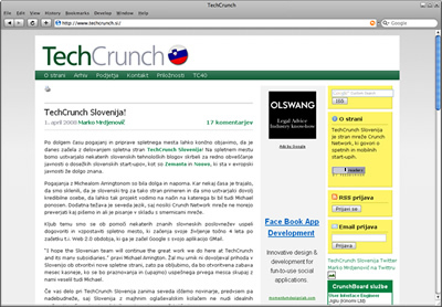
Announcing TechCrunch Slovenia!

Tuesday, April 1st, 2008

After a month of hard negotiation and work I’m proud to present:
TechCrunch Slovenia

The site is in Slovenian and you can read more at www.techcrunch.si.

24ur.com relaunched

Tuesday, April 1st, 2008

What we got:

What we didn’t get:,

  • yslow – >160 requests for >450k – but it takes more time to load, probably due to javascripts in the head
  • microformats – wishful thinking
  • openid – wishful thinking

What I didn’t check but I think it’s safe to say we didn’t get:

  • blogs compatibility
  • screen saver for banners

Another thing we lost in the transition is the TV guide. I don’t know where they lost it but you can get it here.

Zemified

Relaunching…

Friday, March 28th, 2008

the webSource: ShutterstockA big Slovenian media house is announcing a relaunch of the biggest Slovenian web page (according to Alexa). Since they own two TV channels they’re advertising it with a short commercial that shows a glimpse of the new design. Another hint is a very very small, almost unreadable banner on their front page which “reads e-volution / evolution continues / next stage in [4] days”. What I want to know is whether it is to be an evolution in technology. That’s why I’ll list a few things I’d want if I was the client:

Semantic use of HTML (tableless layout)

The current page sports a fat table layout. The time of lame browsers and the need to create such a layout has passed and using semantic HTML for all the elements is the standard now. As a fan of XHTML Strict I’d also opt for that, allowing users to use the page as a source of content.

Width

The current page is 800px wide with a skyscraper banner on the right. I think a wider default with a hint of elasticity (that would make it almost or completely useful on smaller screens) would be a great choice. If elastic is too difficult I’d opt for 960px.

YSlow

The current homepage needs more than 180 request and more than 700kB to download. It takes about 5 seconds to do all this. I’m sure that with a little smarter use of CSS and image sprites these numbers could be much lower. A smart thing would be to move the static content to static.24ur.com so the browser could download all the resources faster. I’d also want the styles to be on the top and the scrips on the bottom. And since they use their own system to deploy banners I would expect them to use WEDJE to deploy them without stopping the site.

Microformats

Since all the content on a certain page is actually a news feed I would want them to use the hAtom microformat, with hCard for people and hCalendar for events and the TV schedule also possible. There’s no need to use propriatary format in the age of interoperability.

Blogs compatibility

I don’t think they should offer blogs, but it would be nice if they had a way to embed their content into blogs commenting on the current events. It would also be great if news posts would allow trackbacks so other people could see who blogged about the news.

Screen saver

I’ve noticed lately that when they have a few heavy banners that it’s important to close the tab the page is in to get the full power out of my computer. This could easily be solved with a screen saver JavaScript that would hide all the banners when a user doesn’t interact with it for some time.

OpenID

With OpenID providers around every corner I really don’t see why anybody would want me to register on their page anymore.

Can you think of anything else?

Zemified

Zemanta is live!

Thursday, March 27th, 2008

Zemanta, a Slovenian start-up that got into seedcamp, moved to London for a few months and came back a few months ago launched their service at Spletne urice yesterday. The service that bares the name of the company helps you enrich the blog posts you’re writing. What you need to do is download their browser extension (only Firefox currently supported) and a box will appear in your favorite blogging tool (WordPress, Blogger, Typepad currently supported) that makes adding relevant images, links and related articles to the post a one-click operation.

I like the technology and I think it will make the life of an ordinary blogger a whole lot easier. What I don’t like that much is the HTML they produce in the blogposts. I understand the dilemmas they have with all the themes and platforms they need to support but adding that much style attributes is really not nice.

Disclaimer: I’ve cleaned up the HTML in this post, to see the output check the demo.

Zemified

Background on html

Monday, March 24th, 2008

There’s a paragraph in the CSS specification regarding the background property that states the following:

For HTML documents, however, we recommend that authors specify the background for the BODY element rather than the HTML element. User agents should observe the following precedence rules to fill in the background: if the value of the ‘background’ property for the HTML element is different from ‘transparent’ then use it, else use the value of the ‘background’ property for the BODY element. If the resulting value is ‘transparent’, the rendering is undefined.

This might lead to a surprise when trying to add a background on top of what you have on the body element – when you add a background property to the HTML element everything will shift. You can observe this in most browsers on the links below.

Before:

html {}
body {background:#fcc;}

After:

html {background:#ccf;}
body {background:#fcc;}

It seems you really have to add a semantically meaningless element…