Archive for the ‘thoughts’ Category

Relaunching…

Friday, March 28th, 2008

the webSource: ShutterstockA big Slovenian media house is announcing a relaunch of the biggest Slovenian web page (according to Alexa). Since they own two TV channels they’re advertising it with a short commercial that shows a glimpse of the new design. Another hint is a very very small, almost unreadable banner on their front page which “reads e-volution / evolution continues / next stage in [4] days”. What I want to know is whether it is to be an evolution in technology. That’s why I’ll list a few things I’d want if I was the client:

Semantic use of HTML (tableless layout)

The current page sports a fat table layout. The time of lame browsers and the need to create such a layout has passed and using semantic HTML for all the elements is the standard now. As a fan of XHTML Strict I’d also opt for that, allowing users to use the page as a source of content.

Width

The current page is 800px wide with a skyscraper banner on the right. I think a wider default with a hint of elasticity (that would make it almost or completely useful on smaller screens) would be a great choice. If elastic is too difficult I’d opt for 960px.

YSlow

The current homepage needs more than 180 request and more than 700kB to download. It takes about 5 seconds to do all this. I’m sure that with a little smarter use of CSS and image sprites these numbers could be much lower. A smart thing would be to move the static content to static.24ur.com so the browser could download all the resources faster. I’d also want the styles to be on the top and the scrips on the bottom. And since they use their own system to deploy banners I would expect them to use WEDJE to deploy them without stopping the site.

Microformats

Since all the content on a certain page is actually a news feed I would want them to use the hAtom microformat, with hCard for people and hCalendar for events and the TV schedule also possible. There’s no need to use propriatary format in the age of interoperability.

Blogs compatibility

I don’t think they should offer blogs, but it would be nice if they had a way to embed their content into blogs commenting on the current events. It would also be great if news posts would allow trackbacks so other people could see who blogged about the news.

Screen saver

I’ve noticed lately that when they have a few heavy banners that it’s important to close the tab the page is in to get the full power out of my computer. This could easily be solved with a screen saver JavaScript that would hide all the banners when a user doesn’t interact with it for some time.

OpenID

With OpenID providers around every corner I really don’t see why anybody would want me to register on their page anymore.

Can you think of anything else?

Zemified

Blogstorming X-UA-Compatible

Monday, January 28th, 2008

I’ve been trying to ignore this issue since I doubted I could have added anything to the debate.

I understand Microsoft, I first saw Chris speak in London and met him later at Mix07 at the POSH table. I can’t say I know what’s going on in his mind but from what I gathered he has a job many of us would not even want. How do you promote standards without breaking the internet – not only stuff other people made but also pages that are made by your own software (think not only FrontPage but also SharePoint) or networks you yourself need to maintain.

What Eric did to prevent a flame war between web developers was amazing. If all the discussions around the development and progress of web related technologies were this civil we’d probably already be using HTML 5 and CSS 3.

Broken by Jeremy Keith outlines the main problem with the technique – you have to use it to disable it. Pardon my language here, but that’s plain stupid.

Or is it?

Reasoning

Microsoft does not want support calls about IE8 breaking pages and they don’t want calls about their SharePoint breaking (believe me, it will). There is no way of knowing when the new IE8 engine should be used. There’s also no way of them saying “Hey guys, change your page for it to work in IE8”, since they’d ultimately be saying “We need to roll a SharePoint update for this.” If you’re making a page for IE8 you can just add this as you make the page.

The ultimate goal

What we need to achieve is that the feature is there to be used but the default for the rendering is IE8 or more generally the latest version of the browser we’re using. To put it another way I think that IE=edge should be the default.

Possible solution #1

IE is famous for it’s yellow status bar. I know people don’t usually see this bar even when it does appear but how about using a semi reliable logic to define whether to render in IE8 or IE7 (think Date header, Generator META tag, HTML features) accompanied with a bar like this:

Page rendered with a legacy display engine. Set the display engine for this domain.

If the META header would be added it would work as described. If it wasn’t it would check a Microsoft provided and internally updated list of set page-rendering pairs (per domain?). If there’s still nothing found we enter the fuzzy logic that is biased to present the page in the latest IE8 rendering. If the fuzzy logic decides that IE7 should be used it displays the infamous yellow bar.

Possible solution #2

Let’s assume that usually pages that are “broken” are broken all over the domain. If this is enough we can use a proprietary solution for this problem. When Adobe Flash wants to make cross-domain requests it first requests a proprietary file called crossdomain.xml. Let’s say that IE8 requests a ua-compatible.xml that contains the URL patterns with corresponding IE rendering engine version. This would defy the idea that there needs to be no change to current pages but I would say that a single file for the whole domain is not too much to ask.

Summary

I know the proposed solutions might not be what we’re looking for (yes, I think I, and all other web developers, have a say in this). What I think we need to do is find other possibilities that might not have the side effects that the current one has. Microsoft might want to elaborate on what they’re looking for – we won’t question their reasons, we’ll just try to find a solutions that suits all of us. So let’s have a brain storming of blog posts (blogstorming?) and we might find the ultimate solution.

Stop Web Pollution

Thursday, January 10th, 2008

SEO is a theme I have been trying to ignore for a long time at Spletne urice, a weekly meeting of (mostly) web professionals. As a programme director and before that only a voice that could be heard my opinion on the matter was that SEO is a simple thing if you’re a web developer (semantic HTML – POSH, web standards, level 1 accessibility) and is a boring issue. The only way a talk about SEO would be interesting was a talk about its dark side. As people might mistakenly think that I (and my predecessor before me) endorse this kind of behaviour I declined any such propositions.

After a few debates and brainstormings I figured what bothered me the most – the notion that all real SEO experts have no conscience and would therefore not be able to talk about the shortcomings of polluting the web with pages that exploit the imperfections of search engines to create traffic and the desperation of users that will click on any banner that promises a better life. I trusted my instincts and invited Mitja to give a talk on SEO and I’m really glad I did. As he said in the talk – a retrospective of what he’s done in SEO made him think and he and Davor (his co-speaker) launched a site called Stop Web Pollution for all of us who don’t want the Internet to become a “big pile of shit”.

While we’re on the topic I’d like to point you to a video of a presentation made on Le Web 3 ’07 conference by Jason Calacanis. You can find it in the “07 – Day 2” tab, the title is “Internet Pollution”.

iPod Shuffle instructions

Wednesday, December 26th, 2007

I love them – it’s 26 pages of pictures with not more than one sentence on the page – all in all only 22 illustrated pieces of information. Only one language – no redundancies.

Dear internet friends

Tuesday, December 25th, 2007

All I want for Christmas is to be able to buy a Nokia N800 Navigation kit. I’m located in Slovenia and the local dealer doesn’t have it, I can’t order it from Amazon (they don’t deliver electronics to Europe) and I can’t find it on Expansys (they were my best bet).

Be nice and help me!

Please?

About forms: messing up the interface

Thursday, December 13th, 2007

When creating interfaces you often come to a point where you need to decide what your priorities are. The most obvious choice is to cater to the needs of the user. Unfortunately when doing online business sometimes this is not easy to achieve due to certain restrictions. It then becomes an economic choice.

To simplify the problem let’s say you’re designing an interface for a contact form. There are a lot of people involved in the problem and they all have their own issues they want resolved.

UX expert

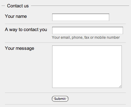
Obviously the users want the form to be simple and can be filled without thinking[1]. Their ideal contact form would only consist of two or three fields. Usually this is also what you would get from the UX guys…

The simple contact form
HTML example – the simple form

Sales agent

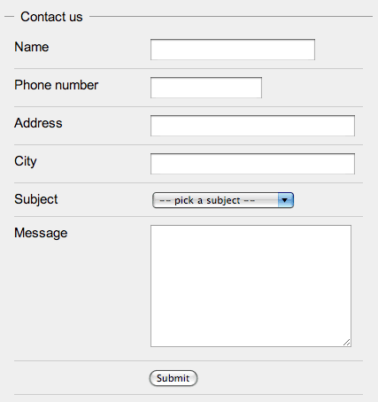
On the other side of the form you should and most probably will have somebody that will process the form, let’s say it’s a sales agent. He’s not going to like what your UX expert mocked up because it doesn’t give him enough information about the lead[2] that is asking the question. So you’d get something like this:

The sales agent wants more data
HTML example – sales agent “enhanced”

Programmer

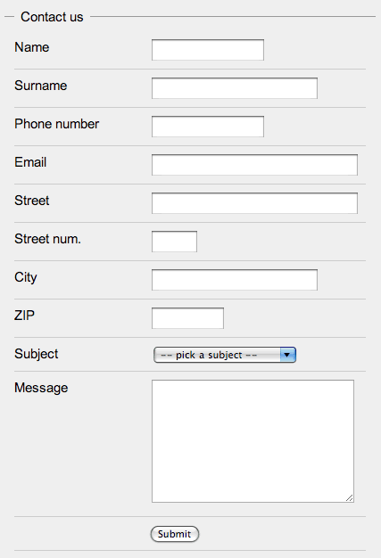
When a programmer sees this she won’t like it at all. She would say that this contact form really gives her no way to enter the data into the customer database. There is no way she can figure out what the name and surname are, what the postal code might be if it’s there at all and she also needs more contact information since the new database requires all customers to have an email address and a mobile phone number. You’d now have a huge contact form like this:

The programmer needs to put this into the database
HTML example – programmer “enhanced”

Marketing

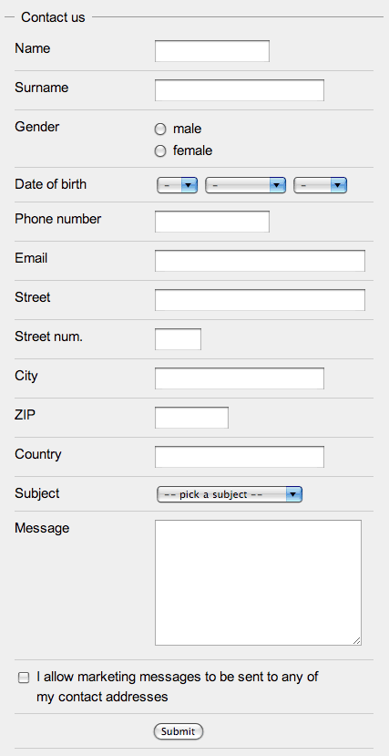
Since everybody has a stake in the website and they know better you would also get the marketing crew to add some checkboxes at the bottom of the form. They might also want some other “relevant” information about the user – at least the date of birth and the gender.

The marketing and the legal kick in
HTML example – marketing “enhanced”

Legal

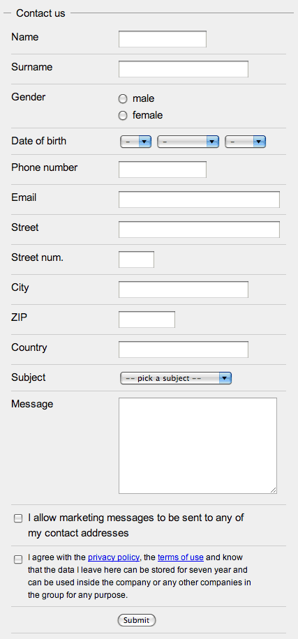
At the end the legal department insists that you add one more checkbox at the end of the form that “blames” the person that submits the form for everything and anything that can possibly go wrong[3]. If you’re lucky the same checkbox will be used to convey that the data will be held for at least seven years and that it can only be uses inside “the group”.

The marketing and the legal kick in
HTML example final version

Oh my!

So now you have a contact form with 15 fields (technically you have 18) instead of 3 which is a surplus of 400% (500%). It’s obvious that each step adds more information that is valuable to the company if it actually uses it. A really good company will know exactly how much the data is worth (lead conversion rates, programming fees, marketing material CTR + conversion, legal issues) and would probably stop at the first form. Others seem to think that this data is more valuable than the drop in the users submitting such forms due to the vast amount of information that needs to be given away.

They want it all

If you can, try to convince the client to use a simpler form. The legal department might help you there if you have any laws in your country that deal with retrieving customer information that is not directly needed to the action taken by the customer. You might be able to create two forms, display each to half of the users and test the responses.

Field length

If you really have to do it, there’s stuff you can do to help people. If you check the example forms you’ll see that the input fields have variable length – they try to match the amount of data that is needed to complete the form successfully. The reason for this is that the form seems easier to fill and doesn’t look like one of those insurance forms you need to fill when you had a car crash.

Simple input

Use various types of fields in a way that helps people fill them correctly. Don’t use a text field if there are only two options and don’t use a free form field for the input of a date. Use checkboxes, radios, drop-downs – they’re each good for something. You can also use advanced JavaScript controls like sliders, calendars or autocomplete but use them wisely.

Validate on the fly

You could also add JavaScript to validate the forms on the fly. By that I mean that while a user is writing in a field some visual cue (like a green tick and a red x) would tell the user the field has been correctly filled. A lot of discouragement with long forms comes from the fear of having to refill the form if a single piece of information is input invalidly.

If you want to know more about forms check out the article Web Application Form Design by Luke Wroblewski or wait for his book Web Form Design Best Practices

  1. Check Don’t Make Me Think: A Common Sense Approach to Web Usability, 2nd Edition by Steve Krug. back
  2. Sales people don’t interact with people, users or any other lifeform – they deal with leads. Read more about leads in Managing Sales Leads: Turning Cold Prospects into Hot Customers by James Obermayer back
  3. If it can go wrong, it will – Murphy’s Law back