The Catch-22 of contextual advertising

April 7th, 2008

Wikipedia states the following:

Contextual advertising is the term applied to advertisements appearing on websites or other media, such as content displayed in mobile phones, where the advertisements are selected and served by automated systems based on the content displayed by the user.

As a content publisher I have the possibility to put ads on my blog and earn a few bucks whenever a visitor clicks on the link. Since I’m to small to be targeted by any advertising agency or advertisers directly (which is proven by the lack of text-link-ads on this page) the contextual advertising is the only way to go.

The goal of contextual advertising is to display ads targeted at the reader of the content and in the case of blogs also the creator / owner of the blog. This essentially means that whenever I check my blog to moderate comments, write a new post or just to check what’s going on I’ll see ads that target me directly. When I see such an ad I’m invited to click it and I sometimes do – when the ad is interesting enough. I click on it as I would click on the same banner if I saw it on any other page.

If we try to see this from the other side – the advertising network will pay me for every click anybody makes on any ads on my blog. Actually the advertisers pay for the ads and a part of that money is passed on to me as the content owner. This means that I could easily place ads on my blog and earn money by just clicking on them. Obviously they will want to prevent such action. A local advertising network ToboAds does this transparently – they told me that they registered a few fraudulent clicks and that it constitutes a breach of their TOS – if I continue to do this they’ll throw me out of the system. I wonder what Google does…

So they’re targeting ME and not letting ME click.

As I talked with a guy from the ToboAds team today it made me think whether I could find a favorable solution for all parties. I understand that this might be hard but how about this – I could only use the money I earn from clicking on “my” ads for buying ads on the same network. Of course if the amount is relatively high there need to be other measures – we wouldn’t want ad networks to charge us for clicks some freak did on their own blog.

I’d really like to know how these guys (oh, and these guys) do it.

Zemified

Start-up night #1

April 2nd, 2008

Mooble

Various cell phones from 1992 to 2004.Image from WikipediaMobile advertising redone with users getting mobile content for free and advertisers being able to target their customers more priceisely. I think they have a huge obstacle in the fact that people are afraid of receiving content on their mobile phone – almost everything here is payable and you can easily empty your prepaid account with messages you accidentally turn on. They have a strategic partner, a local newspaper Dnevnik. Since it’s free I suggest you try the service. You can always turn it off if you don’t like it.

Odpiralni časi

A search engine for opening times of stores – on a small local market that is Slovenia, having a where is less important then the when. So search is not geo based but only keyword based, they are planning geo search too but cannot afford the database yet (18kEUR). They use scrapers to get fresh content, having your data in the search engine is free but it has to be fresh – stale entries are thrown oue. The revenue feed will be advertising, geo based. The application is made with Ruby and has some interesting backend features. It also provides an XML representation of data that is useful for reusing the content. A mobile version is also available.

Avtocenter.si

Working on a stage full of formidable competitors avtocenter.si tries to add value to the process of buying a used car by adding more information on the page, incorporating user feedback and other similar features. They will provide TCO calculations for specific models, graphs of prices. Going mobile is also a priority since when you’re buying a car you can check the competition on the spot with your mobile phone. Getting the sellers is another issue – they’re offering tools to improve the publishing experience for return sellers for a small fee. Additional feed of revenue is advertising.

To sum up…

All of these start-ups have these features (already deployed or in the pipeline):

  • Geo / location based
  • Mobile (edition)
  • Advance targeting algorithms
Zemified

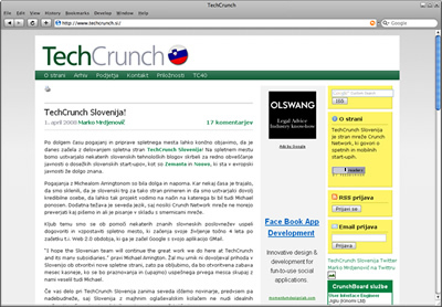
Announcing TechCrunch Slovenia!

April 1st, 2008

After a month of hard negotiation and work I’m proud to present:
TechCrunch Slovenia

The site is in Slovenian and you can read more at www.techcrunch.si.

24ur.com relaunched

April 1st, 2008

What we got:

What we didn’t get:,

  • yslow – >160 requests for >450k – but it takes more time to load, probably due to javascripts in the head
  • microformats – wishful thinking
  • openid – wishful thinking

What I didn’t check but I think it’s safe to say we didn’t get:

  • blogs compatibility
  • screen saver for banners

Another thing we lost in the transition is the TV guide. I don’t know where they lost it but you can get it here.

Zemified

Relaunching…

March 28th, 2008

the webSource: ShutterstockA big Slovenian media house is announcing a relaunch of the biggest Slovenian web page (according to Alexa). Since they own two TV channels they’re advertising it with a short commercial that shows a glimpse of the new design. Another hint is a very very small, almost unreadable banner on their front page which “reads e-volution / evolution continues / next stage in [4] days”. What I want to know is whether it is to be an evolution in technology. That’s why I’ll list a few things I’d want if I was the client:

Semantic use of HTML (tableless layout)

The current page sports a fat table layout. The time of lame browsers and the need to create such a layout has passed and using semantic HTML for all the elements is the standard now. As a fan of XHTML Strict I’d also opt for that, allowing users to use the page as a source of content.

Width

The current page is 800px wide with a skyscraper banner on the right. I think a wider default with a hint of elasticity (that would make it almost or completely useful on smaller screens) would be a great choice. If elastic is too difficult I’d opt for 960px.

YSlow

The current homepage needs more than 180 request and more than 700kB to download. It takes about 5 seconds to do all this. I’m sure that with a little smarter use of CSS and image sprites these numbers could be much lower. A smart thing would be to move the static content to static.24ur.com so the browser could download all the resources faster. I’d also want the styles to be on the top and the scrips on the bottom. And since they use their own system to deploy banners I would expect them to use WEDJE to deploy them without stopping the site.

Microformats

Since all the content on a certain page is actually a news feed I would want them to use the hAtom microformat, with hCard for people and hCalendar for events and the TV schedule also possible. There’s no need to use propriatary format in the age of interoperability.

Blogs compatibility

I don’t think they should offer blogs, but it would be nice if they had a way to embed their content into blogs commenting on the current events. It would also be great if news posts would allow trackbacks so other people could see who blogged about the news.

Screen saver

I’ve noticed lately that when they have a few heavy banners that it’s important to close the tab the page is in to get the full power out of my computer. This could easily be solved with a screen saver JavaScript that would hide all the banners when a user doesn’t interact with it for some time.

OpenID

With OpenID providers around every corner I really don’t see why anybody would want me to register on their page anymore.

Can you think of anything else?

Zemified

Zemanta is live!

March 27th, 2008

Zemanta, a Slovenian start-up that got into seedcamp, moved to London for a few months and came back a few months ago launched their service at Spletne urice yesterday. The service that bares the name of the company helps you enrich the blog posts you’re writing. What you need to do is download their browser extension (only Firefox currently supported) and a box will appear in your favorite blogging tool (WordPress, Blogger, Typepad currently supported) that makes adding relevant images, links and related articles to the post a one-click operation.

I like the technology and I think it will make the life of an ordinary blogger a whole lot easier. What I don’t like that much is the HTML they produce in the blogposts. I understand the dilemmas they have with all the themes and platforms they need to support but adding that much style attributes is really not nice.

Disclaimer: I’ve cleaned up the HTML in this post, to see the output check the demo.

Zemified