Archive for the ‘html’ Category

About forms: messing up the interface

Thursday, December 13th, 2007

When creating interfaces you often come to a point where you need to decide what your priorities are. The most obvious choice is to cater to the needs of the user. Unfortunately when doing online business sometimes this is not easy to achieve due to certain restrictions. It then becomes an economic choice.

To simplify the problem let’s say you’re designing an interface for a contact form. There are a lot of people involved in the problem and they all have their own issues they want resolved.

UX expert

Obviously the users want the form to be simple and can be filled without thinking[1]. Their ideal contact form would only consist of two or three fields. Usually this is also what you would get from the UX guys…

The simple contact form
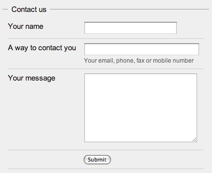
HTML example – the simple form

Sales agent

On the other side of the form you should and most probably will have somebody that will process the form, let’s say it’s a sales agent. He’s not going to like what your UX expert mocked up because it doesn’t give him enough information about the lead[2] that is asking the question. So you’d get something like this:

The sales agent wants more data
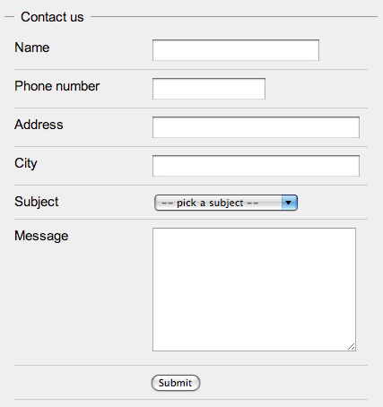
HTML example – sales agent “enhanced”

Programmer

When a programmer sees this she won’t like it at all. She would say that this contact form really gives her no way to enter the data into the customer database. There is no way she can figure out what the name and surname are, what the postal code might be if it’s there at all and she also needs more contact information since the new database requires all customers to have an email address and a mobile phone number. You’d now have a huge contact form like this:

The programmer needs to put this into the database
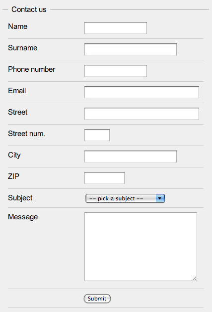
HTML example – programmer “enhanced”

Marketing

Since everybody has a stake in the website and they know better you would also get the marketing crew to add some checkboxes at the bottom of the form. They might also want some other “relevant” information about the user – at least the date of birth and the gender.

The marketing and the legal kick in
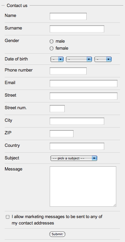
HTML example – marketing “enhanced”
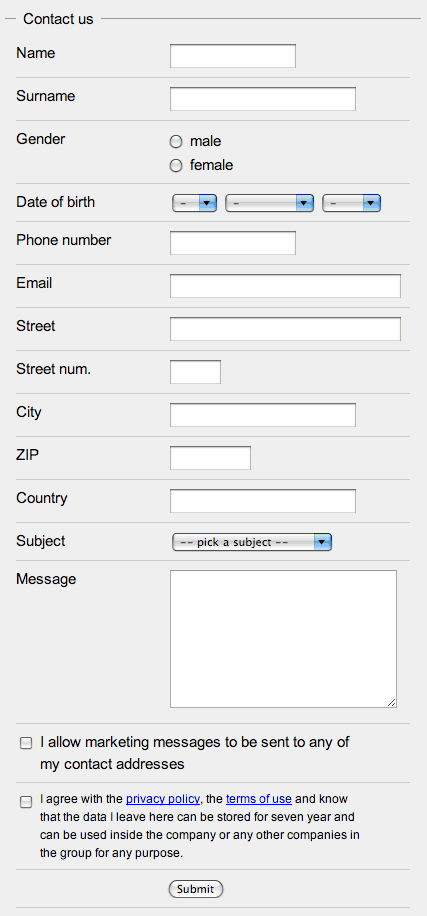
Legal

At the end the legal department insists that you add one more checkbox at the end of the form that “blames” the person that submits the form for everything and anything that can possibly go wrong[3]. If you’re lucky the same checkbox will be used to convey that the data will be held for at least seven years and that it can only be uses inside “the group”.

The marketing and the legal kick in
HTML example final version

Oh my!

So now you have a contact form with 15 fields (technically you have 18) instead of 3 which is a surplus of 400% (500%). It’s obvious that each step adds more information that is valuable to the company if it actually uses it. A really good company will know exactly how much the data is worth (lead conversion rates, programming fees, marketing material CTR + conversion, legal issues) and would probably stop at the first form. Others seem to think that this data is more valuable than the drop in the users submitting such forms due to the vast amount of information that needs to be given away.

They want it all

If you can, try to convince the client to use a simpler form. The legal department might help you there if you have any laws in your country that deal with retrieving customer information that is not directly needed to the action taken by the customer. You might be able to create two forms, display each to half of the users and test the responses.

Field length

If you really have to do it, there’s stuff you can do to help people. If you check the example forms you’ll see that the input fields have variable length – they try to match the amount of data that is needed to complete the form successfully. The reason for this is that the form seems easier to fill and doesn’t look like one of those insurance forms you need to fill when you had a car crash.

Simple input

Use various types of fields in a way that helps people fill them correctly. Don’t use a text field if there are only two options and don’t use a free form field for the input of a date. Use checkboxes, radios, drop-downs – they’re each good for something. You can also use advanced JavaScript controls like sliders, calendars or autocomplete but use them wisely.

Validate on the fly

You could also add JavaScript to validate the forms on the fly. By that I mean that while a user is writing in a field some visual cue (like a green tick and a red x) would tell the user the field has been correctly filled. A lot of discouragement with long forms comes from the fear of having to refill the form if a single piece of information is input invalidly.

If you want to know more about forms check out the article Web Application Form Design by Luke Wroblewski or wait for his book Web Form Design Best Practices

  1. Check Don’t Make Me Think: A Common Sense Approach to Web Usability, 2nd Edition by Steve Krug. back
  2. Sales people don’t interact with people, users or any other lifeform – they deal with leads. Read more about leads in Managing Sales Leads: Turning Cold Prospects into Hot Customers by James Obermayer back
  3. If it can go wrong, it will – Murphy’s Law back

Firefox and Opera statistics are underrated

Wednesday, September 5th, 2007

While testing browser behavior regarding inline JavaScript evaluation and the back and forward buttons I found a very interesting thing. When a script is included in the HTML to execute on parsing (not on load but inline) Internet Explorer (7 on Vista tested) and Safari 3 for Windows will re-execute the script when a user returns via the back button. In my mind this is the correct behavior, since you actually visited the page twice.

The thing is that Firefox (2.0.0.6 on Vista tested) and Opera (9.20 on Vista tested) don’t agree with me. Well maybe they do and don’t live by their beliefs. What they do is nothing. You come back and no scripts are executed. Not even one request is sent to the server in Firefox.

This “feature” is sometimes a great thing – all the AJAXy stuff and all the JavaScript enhancements are already there and don’t need to be rendered again in turn saving power and time. At other times it’s a pain in the a** since some stuff does return to its default state and some doesn’t. This problem is most often observed with dynamic/advance forms that lose their default values/states. Since even onload is not fired this can get annoying…

Besides all the interface problems you might encounter due to this “rogue” behavior, there are also a few issues regarding statistics. It’s harder to inspect the path of a user, the time a user spent on a page, the number of page views in a visit and other related metrics. The other significant issue is that browser usage statistics might be skewed. To answer this last issue we’d have to know how these statistics are measured.

Let’s take a user that is used to clicking the back button while navigating a site with a 2 level deep navigational tree. She comes to the page, goes in one branch and then to a second, very distant branch. Internet Explorer would register 7 page views (1 on the root, 2 to get down, 2 back up and 2 more down), while Firefox would only register 5 page views (1 on the root, 2 to get down, ignore the 2 back buttons, 2 more down) – a 1.4:1 ratio.

If the statistics are based on sessions or unique users we have 50% IE and 50% FF. If we base them on hits we have 58% IE and 42% FF – a 16 percentage point difference or as we said before a 40% difference. This is not something you could just ignore…

Exercise for the reader – why do “unsupported” browsers always have a small browser share in hit based browser metrics?

Flash video not loading

Friday, May 25th, 2007

My colleagues have just found out that when loading a Flash video file into Flash, the URL must end with “.flv”.

Flash doesn’t check the type – if the URL does not end with “.flv” it won’t even request the file. This could lead to an endless battle between the Flash developer and the web developer because the static version would work and the online version wouldn’t. The Flash developer requests a static .flv file on the disk but when the web developer changes the request to a CMS based file the video doesn’t load.

So, when using a CMS what you’d do is add a “&ext=.flv” or even just “&.flv” to the CMS provided URL (eg. /loadContent.php?id=123) for it to load. You can do that in Flash or in the code that passes the video URL to the player.

Funny.

Update: While checking other sites that load dynamic .flv files I found out that it might just look if the “.flv” is in the URL. Still funny though.

The tables – part 2

Tuesday, May 22nd, 2007

In The tables – part 1 I wrote about how the basic table elements should be used in a POSH document.

What we have until now is shown in example 3:
<table summary=”The steady growth of the company revenues in the last 10 years”>
<caption>Company revenues in the last 10 years</caption>
</table>

As promised, we’ll now tackle are the <colgroup> and the <col> tags.

Column group

When you look at tabular data it doesn’t take long to figure out that the data is grouped in two different ways – rows and columns. If you’ve ever produced a table in HTML you’ll know that you create it by creating rows and then creating cells in them. This means that accessing data by columns is not really all that easy. What you do is go through all the rows and get the cells of the correct index and retrieve the data. The same goes for styling cells in a specific column.

Setting a table cell to align the text to the right would commonly be achieved by assigning it a certain class name that would be associated with a CSS rule that would align the text to the right [1]. When applying the same style to the whole column the intuitive thing would be to add that style to all the cells in the column.

But! Here comes the <colgroup> element.

The semantic meaning of the <colgroup> elements the grouping of columns into groups. Not surprising. What you can get from this is the possibility to style these columns. The colgroup element has a few available attributes:

  1. span sets how many columns are in the colgroup. It defaults to 1,
  2. width sets the width of the whole group,
  3. align sets the text-align of all the cells in the column,
  4. valign sets the vertical-align of all the cells in the column,

Span is only used if the <colgroup> elements contains no <col> elements – in that case the number of columns is calculated from the spans of the child <col> elements. The width contains the width of the columns included in the <colgroup> element but is overridden by widths of the child <col> elements if present. It may contain a special value of 0* which means that the element should be as small as possible but enough to contain all the content.

Two additional attributes are present in the standard – char and charoff but support for them is not required by the standard so we’re not going to go into them even though their use could be useful in some cases.

Column

To specify a column without grouping columns into groups you can use the <col> element. You can also use <col> element to specify special columns inside a column group. If you use one directly inside the <table> you cannot use the other.

The attributes for the element are the same as for the <colgroup> element. They’re also used in the same way.

Problems

<colgroup> and <col> seem like a solution to a lot of problems when styling tables. You often want a whole column to be aligned to right, to have a certain background or be in a specific color. You might even want it to have a different border. All this could be done with a styling of the class name or the id of these elements.

Unfortunately all this only works in Internet Explorer. It doesn’t work in Firefox 2.0 (none of it) or Opera9.2 (only align attribute works, styling with CSS doesn’t). I don’t know if it works in Safari but that doesn’t really matter since the later is enough of a reason not to use this for styling. The only thing that is useful (it works in all the browsers tested) is the width attribute.

You can check all this in the example #4.

Next time…

In the next edition of the tables, hopefully less then two months away, we’ll check the content grouping tags, the thead, tbody and tfoot.

  1. No, align=”right” would not be ok and style=”text-align:right;” is also not the best idea due to the problems of changing this style and applying it to more cells. back

The semantics of <small> and a POSH pattern for footnotes

Sunday, May 20th, 2007

It was probably more than a month ago that markos asked me about the semantics of less important items. We had a short discussion about it and found no relevant tags to mark up a part of text that was less important than the rest of it. An easy example would be a footnote, legal text or any other stuff you would usually make smaller in the world of looks over semantics.

A few days ago I was reminded that I forgot to write about it back then when I saw this issue resurface on the WSG mailing list.

When the semantics of HTML were on question a lot of the tags were ‘deprecated’. Not all marked deprecated in the standard itself, but rather marked as bad practice in the web standards community [1]. When trying to tell the client something is important you really should not be telling it to show it in bold typeface – you have CSS to do that [2].

The problem is that when all these presentational elements were ‘killed’ somebody wasn’t thinking. Let’s see:

  1. <b> ‘deprecated’ in favor of <strong>
  2. <big> ‘deprecated’ in favor of ?
  3. <br> discouraged in favor of <p>
  4. <i> ‘deprecated’ in favor of <em>
  5. <s> and <strike> deprecated in favor of <del>
  6. <small> ‘deprecated’ in favor of ?
  7. <tt> ‘deprecated’ in favor of <code>
  8. <u> deprecated in favor of <ins> and because of confusion with <a>

You might have noticed the question marks in the list. The first one, the tag that is supposed to be a semantic for <big> isn’t really all that important. We have many ways to point out that something is important (if there was a semantic meaning – <h1>…<h6>, <strong>, <em>) or just use CSS to change it to big. The problem lies in the latter question mark. How do you mark something that used the small as some sort of semantic and not just a way of presenting the data visually?

In the standard these are actually specified in the Graphics part of it. The meaning of <small> is Renders text in a “small” font. That’s great, but what if I want to tell the world that what I put in there is a legal text? Footnote? Something deemphasized? POSH patterns to the rescue.

As you might have noticed this post uses footnotes. I’ve marked them so that the text in the article links to the footnote bellow and the footnote links back. To show that this is a footnote relation I’ve added a forward relation rel=”footnote” to the link in the text and a reverse relation rev=”footnote” in the footnote itself. I’m also using these to set the styles (which makes them break in IE6 and other stinky browsers). The footnotes are marked up as an ordered list (<ol>) with a class name “footnotes” and each footnote is a list item (<li>) which has an id “footnote-footnoteid-postid” that enables me to link to it.

When marking up legal notices you might want to use rel=”license” and link it to the part of the content you’re specifying the legal text for with a rev=”license” if you don’t have a link to it; if you’re specifying it for the document just link to the page.

  1. Some are deprecated in HTML 4.01, removed in XHTML 1.0 Strict and some just marked as bad practice. For more details check the specification or other sources. back
  2. If you want more information why this is the way to go please read the POSH page and the articles and presentations linked on that page. back

I’m POSH – are you?

Sunday, April 22nd, 2007

It seems that the core of the Microformats community finally realized that the Microformats hype grew over the small group of web developers that already produced semantic markup and wanted to add even more semantics to it. Now every Microformats fan thinks there should be a Microformat for everything instead of just asking themselves a more important question – “What’s the best semantic way to present this content?”

POSH diagram by factoryjoe
Created by factoryjoe, released under CC by-nc-sa license

That’s where POSH comes in. It stands for Plain Old Semantic HTML. POSHers promote the use of semantic use of HTML which means more than just not using tables for layout. I think that something wasn’t communicated clearly enough and that is the fact that Microformats are born out of a repeating pattern of content presentation which concerns many people and many websites. That’s one of the reasons I never pushed for any new Microformats and was more often than not annoyed by people doing just that. What good can come from a big number of formats that you can’t use because you can’t really know them all?

That said, go practice POSH, document techniques and your own solutions to problems. If some of these problems outgrow the POSH pond they might be turned into a Microformat that we can all follow. If not it’s still a great idea that you can check how other people are solving problems when you stumble upon them.