When laying out a website everybody has a few building blocks that they keep using over and over. The more layouts you make, the more refined these blocks are. And the better. I’m not talking about creating the HTML but rather the IA (information architecture) phase of the creation process when you’re creating wireframes with boxes that represent content.
I recently read an article on design paradigms for lots of data which made me think about what I commonly use when laying out pages. I’ll call this the one-few-many content pattern.
The main premise is that content on a website is presented in one of three basic forms – “one”, “few” and “many”. Let’s see what all these are and how they work together.
One
This one is the most obvious and consists of displaying a single entry. When you do this you will most probably want all the data a certain entry (asset) contains. You will use this block for a single news item, blog post, product page or anything similar.
To lay out the single content you will first need to decide on the importance of content parts, then set the layout. You will need to think about what content you’ll always have and what you might not. A common case of this are images that can change the form factor and might not even be present sometimes. When you know what you’re working with you’ll want to set priorities and based on that the size and shape of the parts. You should know that users can only focus on a few things – if everything is important and exposed essentially nothing is. The common solution in the cases is to put the image title on the top left, add meta data (author, date and similar) just below it. A single image is positioned on the top left with content flowing around it. A nice touch to this layout is to have the image a few lines below the top.
Few
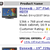
A little less obvious that the previous one. This is usually a list, that is not a true list, but a short tasting of what’s there. You might think of this as “last 5 news” or lists on the front page that only list a few items. To display these you will not need as much data as you would for “one” but you need something. For a news and blog posts you’ll need at least the abstract, products will need the image, prices, discounts,…
You will see this block in many different shapes. You might see a thumbnail image with a title and an abstract in online stores you will see more data. In some cases it nowadays replaces the many block. A big part of this is that searching is very popular (no more lists) and using this block gives more information than using a simple many block.
Many
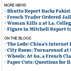
The last one of the bunch is pretty obvious but it might be hard to tell the difference between the last two. This is a list that is primarily used to list content when you have a lot of content and you do not want a user to browse through 10+ pages of paginated content or scroll 30 screens down to find something. You usually need less content, a title will usually do the trick, sometimes you need the date, products definitely need the price.
Using this is very easy and utterly unpopular. Displaying data only as a list is not very user friendly since it requires reading – something people rarely do on the web. This is why the many block often disappears in favor of the few block. A common place to find it is in the search results or the archive page.
To demonstrate the use let’s think about a simple corporate web page. On the first page you’ll most probably want to show a set of products using the few block, some news, again using a few block. Most of the content on the page will be using the one block since you’ll only have single articles describing what the company does. The news portion of the site might use the few block on the landing page, the many block for the archive and of course the one block to display a single news post. Displaying the products will be a bit different – the landing page might use the few block to display exposed, new or discounted products. The category listings will use the many block which will include an image with the title and some products specs or a short description. Again you’ll be using the one block to display a single product.
This doesn’t solve all the problems when laying out the page. It helps me define the main blocks and the content that’s used to display them on the page. It also makes some of the choices easier and helps the designers envision what the final, more detailed wire-frame might look like early on in the process.
