Archive for the ‘vista’ Category

Fluid searchbox

Sunday, October 4th, 2009

There’s been a lot of fluid layouts recently. When you use a fluid layout it’s hard to make everything fluid as you need to stretch certain elements and have other elements fixed.

I was approached some time ago by a designer who was working on a fluid design but was having problems with a HTML/CSS only solution for a fluid searchbox. The idea to create a searchbox that grows when the window grows is simple, but becomes a tad more difficult when you add stuff to the left and right of it, some being fixed width (width in px or em) and some fluid width (width in %).

As I like challenges I took it on and produced a sample that worked on most modern browsers in a single evening. They didn’t like it because it didn’t work in IE7 (cause I never checked it) even though the fix for IE (it was only IE7 that didn’t work) was trivial. After a while I went back and checked it out again, changed the code a bit and I think it’s much better now.

The simple form

Creating a fluid search box when you only have a single element next to it is trivial. What you do is wrap the input in an element and use padding to create space for the fixed element, then position the fixed element absolutely (or relatively) in the space created by the padding.

HTML:
<fieldset>
	<div>
		<input type="text" name="q" value="" />
	</div>
	<input class="s" type="submit" value="Search" />
</fieldset>
CSS:
fieldset {position:relative;padding:0;}
div {padding-right:6em;}
div input {width:100%;}
input.s {width:5em;font-size:1em;position:absolute;right:0;top:0;}
Sample

You could target the input with input[type=submit] but that wouldn’t work in older browsers.

A complex form

The complex form from the intro includes a title, a search type drop-down (select element), the input box and a submit button. This gives us four elements, two of which are fixed and two fluid – and more stuff to hack around.

HTML
<fieldset>
	<div class="l">
		<span>Find</span>
		<select name="type">
			<option>in Books</option>
			<option>in DVDs</option>
		</select>
	</div>
	<div class="c">
		<input type="text" value="" name="q" />
	</div>
	<div class="r">
		<input type="submit" value="Search" />
	</div>
</fieldset>
CSS
fieldset {margin:0;padding:0;position:relative;border:0;}
fieldset .l {height:0;}
fieldset .l span {width:3em;display:inline-block;}
fieldset .l select {width:10%;}
fieldset .c {margin:0 60px 0 4em;padding:0 .7em 0 10%;}
fieldset .c input {width:100%;}
fieldset .r {position:absolute;right:0;top:0;}
fieldset .r input {width:60px;}
* html fieldset .l {float:left;width:100%;margin-right:-100%;}

The basics

I created three elements that help me align elements. I’m using classes l for left, c for center and r for right. The left element includes the title and the type, the central element includes the search box and the right element includes the submit button.

fieldset .l {height:0;}
fieldset .r {position:absolute;right:0;top:0;}

The left element has its height set to 0 so it seemingly doesn’t take any space. The central element includes the input and needs no special positioning, while the right element is positioned similar to the simple solution – absolute and set to right.

The surrounding elements

You can set the width of these elements in any unit you like. I set the width for the span element in em, type drop-down in % to make it fluid and submit button in px.

fieldset .l span {width:3em;display:inline-block;}
fieldset .l select {width:10%;}
fieldset .r input {width:60px;}

The only thing you need to do in CSS is set the width to these elements. You need to set the display property on the span element to work around the fact that inline elements don’t allow setting of width.

The fluid input

fieldset .c {margin:0 60px 0 4em;padding:0 .7em 0 10%;}
fieldset .c input {width:100%;}

The input needs its width set to 100% so it will stretch the whole available width of the parent. That happens due to the fact that block-level elements will grow to 100% automatically and the margin and padding will “shrink” its contents. This allows setting the spacing in two different units – one for margin and one for padding. If you look at the CSS rule, you’ll see that the widths are similar to those set for the surrounding elements – of course with some spacing added.

  • Right: 60px margin (width of the submit button), .7em padding (spacing)
  • Left: 4em margin (3em for the title + spacing), 10% padding (type select width)

The browsers

You can check out a sample page with the complex form. Working on Windows I’ve tested it in these browsers:

  • Firefox: 2.0, 3.0, 3.5
  • Opera: 10
  • Safari: 4
  • Google Chrome: 3
  • Internet Explorer: 8 (with its rendering of IE7 Standards and Quirks)

As always at least one browser had to fail – IE6 did. The problem was height:0; as IE6 will render elements as high as their content. We can work around this by changing the way we make it zero width/height so it doesn’t affect the central element.

* html fieldset .l {float:left;width:100%;margin-right:-100%;}

I’m using the IE6 CSS filter to target IE6, you can use conditional comments or whatever you like best. The rule floats the element left, making it 100% wide, but resets the position by setting the right margin to -100%.

As I’m using display:inline-block; this will work a bit different on browsers that don’t support inline-block. In Firefox 2.0 you can use display:-moz-inline-box; in the rule for the span, but make sure you put it before the inline-block.

fieldset .l span {width:3em;display:-moz-inline-box;display:inline-block;}

Last words

You might want to fix some stuff in some browsers so everything aligns nice. The techinque used is derived from the multi-unit any-order column layout by Eric Meyer as it opens your mind on how to use multiple units in a single layout without fuss. I’ve tried all the browsers I have on my dev machine and I’m not saying it works everywhere. If you find a browser where it doesn’t post a comment; if you find a better way of doing things also post a comment.

Reblog this post [with Zemanta]

Top 10 Usability Lows Of Mac OS

Wednesday, August 13th, 2008

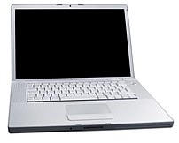
White MacBook laptopImage via Wikipedia I’ve been using a Mac since I started my job at Zemanta. I wanted to have a Mac because I want to be able to use Windows and Mac OS and change from one to the other seamlessly. When I saw Top 10 Usability Highs Of Mac OS on Smashing Magazine and read the first point I figured that I don’t agree with the list. Strongly.

  1. Consistency

    There’s probably a lot of stuff that acts completely consistently but I think we can find this in all operating systems. What I really hate is that moving through text with the keyboard is really utterly inconsistent on a Mac. My Macbook keyboard is missing buttons that are very valuable to me when coding – Page down, Page up, Home, End. There are hints of these with Fn + arrow keys but in every application these act differently. And this all changes when using the wireless keyboard. The same goes for jumping over words / phrases…

  2. Intuitivity

    I didn’t get the install. Why would I have to drag something to Applications if I already decided to install it? It’s like a waiter coming back and rechecking your order. And it’s not really that intuitive – it took me a few installs (to get one where it was neatly explained with a “drag the app to the Applications to install”) to get it.

  3. Effective and appropriate metaphors

    I could agree with this but then again I have the desktop set to two screens and when on the top screen and an application is positioned so that it should appear on the bottom screen it doesn’t. Which isn’t really consistent. After a few tries I figured out that you can actually move stuff around if you persist long enough. Made me think though.

  4. Informative error reporting on-demand

    If this was true it would tell me that my wireless connection went down and I wouldn’t have to recheck it all the time. And it goes down often even though the other side is a Time Capsule which should be totally compiant.

  5. Hiding the technical details

    Great for novice users. But once in a while you want to get to know something more about your computer. And then you have to download 1GB of developer tools to get a simple compiler. I know, I’m not the target audience, I should really have a Linux instalation, right?

  6. Fitts’ Law

    I’m quite sure that I do a lot more mouse miles on a Mac than on a PC. There’s a simple reason — when you have two screens you have to decide where your menu bar will be. And if you’re using an application on the other screen you’re bound to have to make a trip every time you don’t know a keyboard shortcut. And you don’t if you’re a rookie user like me. I think this was a neat idea in the age of small single screens but times have changed – need to move on Apple

  7. User input feedback

    Having no OK and using auto-save and auto-apply where possible is great. If it really would be used this way consistently. Unfortunately some situations aren’t really the auto-save type and this makes you think – will the next click already apply or will it just change it and I can undo everything I made with a simple click on the Cancel button?

  8. User support and navigation

    This really is a great feature but it’s not a plus anymore. Vista has the same feature implemented and if we only look at it from a view of a user the only difference is that Vista’s is a bit slower. On the other hand it finds more stuff.

  9. Workflow

    This has more to do with the way you use an OS then the features of Mac OS. The only difference is that Mac OS actively discourages maximizing apps and has more features that help you find lost windows. The difference is getting smaller though.

  10. Even kernel panic looks nice!

    Haven’t ever seen a kernel panic yet. That doesn’t mean my Mac has never crashed, it only means I never saw a the panic screen. It crashed with a black screen, auto restart or just freezing.

I agree that there are many features that stand out on the Mac OS X but it also has a lot of stuff that is not as good as it could be. A nice example is the Finder that looks the same when opened as an application or when used as the browse window in another application. The only problem is that in the second case all the control-click options are gone and if you try to open a file and remember you have to update your repository first you have to go to another window and update it there.

Reblog this post

Review: Adria Airways and NLB

Monday, June 16th, 2008

Recently two more big and very frequented Slovenian sites relaunched and I think they too deserve a mention.

Adria Airways

The first page I want to put to the test is the new page of the first and the biggest Slovenian airline. It was recently launched by my ex colleagues at Parsek as the second version to be made there. The first edition was designed and prepared in another agency and Parsek only did the backend while the new version is all Parsek. To be fair the biggest and the most important part — the reservation module — is still made by the french company Amadeus.

The new design tries to incorporate a leaner navigation with less elements even though it became wider, almost reaching the 1000px mark. The front page is much more sales oriented, displaying a lot of useful information. I can’t get past the color scheme that is really too dull. There are quite a few validation errors, the ones in HTML mostly due to non–escaped ampersands, while those in CSS are just sloppy coding without checking the validator.

I was surprised to see that some stuff doesn’t work well with Firefox 3 and Safari 3 even though the first one isn’t released yet (will be tomorrow) and the second one doesn’t have a lot of users in Slovenia. I’d still stick to what Yahoo! has to say in their Graded Browser support table for browser support.

I was positively surprised at how well some inside pages are designed down to the last dot and icon and negatively how bad the pages that “only” present CMS content look. I don’t know whose fault this is and I don’t even care, it doesn’t matter for the end user. I’m sure the guys at Parsek will check these pages out and try to make changes that will make them better. When I first saw the design while I was still at Parsek I wasn’t sure if the title on the right would work but now that I’m surfing the page I actually think it does. There is one problem there though – if you visit this page (screenshot) you’ll see that you can see its title “About us” four times in a very small area. It’s nice to know where you are but isn’t this a little bit too much?

NLB

The next big redesign is the biggest Slovenian bank which redesigned their site after quite a while. I don’t really know what to say about the redesign – the last one was horrendous so this one is easy on the eye. It too got wider and restructured so people can find relevant information easier. The home page lists all the products for residents and businesses so you can access them directly.

If the design got overhauled the backend didn’t — if it did it got it fashion tips from the 90s. Validation returns a lot of errors and — prepare for a shock — the encoding is iso-8859-2. The number of non semantic elements is significant and inline scripts are there too (<SCRIPT language=JavaScript>).

The most interesting thing about the new page is the fact that it now uses “friendly URLs”. And how utterly broken they are. You could also say this page is a textbook case for how wrong things can go when you don’t think about them. So you’ll have two pages, one at /nalozbe-v-vrednostne-papirje and the other at /nalozbe-v-vrednostne-papirje1. I have no idea how that tells you anything about how the content behind these links is different. It would tell you more if the first was prefixed with /residential and the second one with /businesses.

Another funny thing I noticed is how banners are designed to look as if they weren’t images but rather just HTML parts of the page. The reason I noticed is that I was on the Mac while checking the page and since font rendering is different it looks really weird. I think I might have seen the same difference on Vista with ClearType on.

Zemanta Pixie

FOWD conference

Thursday, April 17th, 2008

MacBook ProImage via WikipediaI’m at the conference and going to conferences without a Mac is obviously a weird thing to do – everybody else has one. The irony being that I’m sitting in the Microsoft lounge and there’s a bunch of people sitting on Microsoft Expression and Silverlight beanbags using Apple computers.

The first thing to disappoint me was that they got my name wrong. I know I have a “weird” (non Latin1) letter in my surname but I thought that Unicode / UTF-8 managed to spread enough for it not to be a problem. Currently my name is “Mrdjenovi_” – yey.

The next thing was that we only got an Adobe plastic bag with a brochure of what’s going on in it. If we got a real bag with a bunch of stuff most of us would have to carry two bags around. But then again the invitation did say that we only need to bring ourselves. If I came with nothing on me I’d be pretty screwed.

Fortunately I found the cloak room and an O’Reilly stand. I left my coat and I now own Ambient Findability.

Zemified

Impressed by Apple

Sunday, June 24th, 2007

Safari for Windows is already in 3.0.1. No, they didn’t fix this flaw, they fixed the other one. Nonetheless, I’m impressed…

After another look at my blog I figured they changed another thing – Google AdSense ads now show up.

Update #1: I’m writing this in Safari for Vista 3.0.2 – for the third time. I cannot shake the feeling that there’s something wrong with submitting the textarea in WordPress. In any case – strongs are now bold and even AdSense appears sometimes. All these issues make me wonder if things appear the same on Safari/Mac and Safari/Win which was a big point in releasing a Windows version…

Update #2: I’m posting the first update in Firefox – exactly as written in Safari. I posted it twice without it appearing on the page. The third time I copied it and found out that it only copies the code until