Archive for the ‘design’ Category

Discovering Greasemonkey again

Friday, August 15th, 2008

Meissner effect: levitation of a magnet above ...Image via Wikipedia I’ve been rediscovering the joy of Greasemonkey scripts lately. For those who don’t know, Greasemonkey is one of the best extensions for Firefox ever made (the other being Zemanta of course:) that allows you to run JavaScripts on specified pages. This doesn’t really mean much to the non-technical crowd, but to us geeks this means you can do almost whatever you want with the page. As I make more and more of these I decided to share them here.

For my Slovenian readers

  1. Finance unfixed is a script that will unfix the header of finance.si. This means the header will scroll and you’ll get more space to read the article.
  2. RTVSlo OI is a script that will remove the header from the OI page on rtvslo.si again leaving you with more real estate for reading.
  3. Delo is a script that will help your eyes when reading delo.si news site since it’s small default line-height might make them hurt.

Developers

  1. JSLint highlighter will help you read the JSLint results. If you write JavaScript and don’t know what JSLint is you should go check!

How to work it

Well first you have to have Greasemonkey installed. After that installing a user script should be as simple as a click of a link. When a script activates you’ll see a little green box that will say ‘Greased’ in the top right corner. Clicking it will toggle the script – either it’s on and active (green) or off and the page looks as it would in the first place (red). You can also toggle the script with alt+g.

Reblog this post [with Zemanta]

New version of Zemanta is out

Thursday, August 14th, 2008

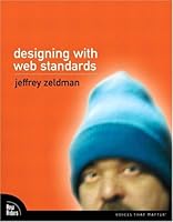
Book cover of Designing With Web StandardsBook cover via AmazonWe released a new version a few days ago.

It’s mostly a bugfix release on the front-end part while there are quite a few fascinating developments on the back end. The first one is that we now suggest CrunchBase links to companies and people and we also suggest images to go with that. So if you’re writing about a start-up, a funding round, investors or anything else that is present in CrunchBase you’re likely to get better suggestions.

We’ve also added Amazon book covers for books that we find in Amazon (like Designing With Web Standards by Jeffrey Zeldman or Transcending CSS by Andy Clarke).

The biggest news is that we were able to transfer the Zemanta experience to Windows Live Writer which is our first desktop application integration. I hope this brings joy to the users of Live Writer. Being the first desktop application integration it didn’t go without glitches but I hope we fixed all the bugs, even those that were found by the first users.

We also have a new home page for everybody who doesn’t yet know what we do. If you don’t have our extension/plugin installed and you’re a blogger give it a go – you won’t regret it.

Reblog this post [with Zemanta]

Top 10 Usability Lows Of Mac OS

Wednesday, August 13th, 2008

White MacBook laptopImage via Wikipedia I’ve been using a Mac since I started my job at Zemanta. I wanted to have a Mac because I want to be able to use Windows and Mac OS and change from one to the other seamlessly. When I saw Top 10 Usability Highs Of Mac OS on Smashing Magazine and read the first point I figured that I don’t agree with the list. Strongly.

  1. Consistency

    There’s probably a lot of stuff that acts completely consistently but I think we can find this in all operating systems. What I really hate is that moving through text with the keyboard is really utterly inconsistent on a Mac. My Macbook keyboard is missing buttons that are very valuable to me when coding – Page down, Page up, Home, End. There are hints of these with Fn + arrow keys but in every application these act differently. And this all changes when using the wireless keyboard. The same goes for jumping over words / phrases…

  2. Intuitivity

    I didn’t get the install. Why would I have to drag something to Applications if I already decided to install it? It’s like a waiter coming back and rechecking your order. And it’s not really that intuitive – it took me a few installs (to get one where it was neatly explained with a “drag the app to the Applications to install”) to get it.

  3. Effective and appropriate metaphors

    I could agree with this but then again I have the desktop set to two screens and when on the top screen and an application is positioned so that it should appear on the bottom screen it doesn’t. Which isn’t really consistent. After a few tries I figured out that you can actually move stuff around if you persist long enough. Made me think though.

  4. Informative error reporting on-demand

    If this was true it would tell me that my wireless connection went down and I wouldn’t have to recheck it all the time. And it goes down often even though the other side is a Time Capsule which should be totally compiant.

  5. Hiding the technical details

    Great for novice users. But once in a while you want to get to know something more about your computer. And then you have to download 1GB of developer tools to get a simple compiler. I know, I’m not the target audience, I should really have a Linux instalation, right?

  6. Fitts’ Law

    I’m quite sure that I do a lot more mouse miles on a Mac than on a PC. There’s a simple reason — when you have two screens you have to decide where your menu bar will be. And if you’re using an application on the other screen you’re bound to have to make a trip every time you don’t know a keyboard shortcut. And you don’t if you’re a rookie user like me. I think this was a neat idea in the age of small single screens but times have changed – need to move on Apple

  7. User input feedback

    Having no OK and using auto-save and auto-apply where possible is great. If it really would be used this way consistently. Unfortunately some situations aren’t really the auto-save type and this makes you think – will the next click already apply or will it just change it and I can undo everything I made with a simple click on the Cancel button?

  8. User support and navigation

    This really is a great feature but it’s not a plus anymore. Vista has the same feature implemented and if we only look at it from a view of a user the only difference is that Vista’s is a bit slower. On the other hand it finds more stuff.

  9. Workflow

    This has more to do with the way you use an OS then the features of Mac OS. The only difference is that Mac OS actively discourages maximizing apps and has more features that help you find lost windows. The difference is getting smaller though.

  10. Even kernel panic looks nice!

    Haven’t ever seen a kernel panic yet. That doesn’t mean my Mac has never crashed, it only means I never saw a the panic screen. It crashed with a black screen, auto restart or just freezing.

I agree that there are many features that stand out on the Mac OS X but it also has a lot of stuff that is not as good as it could be. A nice example is the Finder that looks the same when opened as an application or when used as the browse window in another application. The only problem is that in the second case all the control-click options are gone and if you try to open a file and remember you have to update your repository first you have to go to another window and update it there.

Reblog this post

Caching in Firefox 3

Friday, June 27th, 2008

@tadej told me a few days ago at the Firefox 3 launch party that he had issues with the way caching is handled in Firefox 3. I didn’t have such issues myself but it reminded me that I didn’t change the caching behavior when I installed it. So yesterday I opened the preferences and found the caching options under Advanced / Network. I was not really surprised that the options for how the cache works were missing — you really don’t want your everyday Joe to change this stuff since it may affect the perceived speed of the browser.

Since this was probably just left out of the interface I opened about:config and filtered with cache which gave me a few entries. The most interesting one was browser.cache.check_doc_frequency. Unfortunately it has a numeric value with a hidden meaning. And I had no idea what that meaning is.

I googled the thing and found a mozillaZine article about it. It explains how it works — the property defines how often the browser checks for a new version of a specific file. The possible values are as follows:

0
once per session
1
everytime
2
never
3
when out of date (default)

The default is 3 which is not very good for development purposes when you want changes to take effect immediately. What you want is 1 which means that every request will go to the server every time. You’ll get many 304s but you’ll also get a 200 as soon as a file changes on the server. So I changed the value to 1 and now I’m a happy developer.

Zemanta Pixie

Firefox 3 Release Event 2008

Tuesday, June 24th, 2008

So I’ll be talking at Firefox 3 Release Event at Kiberpipa today. Feel free to come listen to the talks or just come to the party. If you can’t come you can watch the whole thing online (the link is likely to be available somewhere on the event page).

Review: Adria Airways and NLB

Monday, June 16th, 2008

Recently two more big and very frequented Slovenian sites relaunched and I think they too deserve a mention.

Adria Airways

The first page I want to put to the test is the new page of the first and the biggest Slovenian airline. It was recently launched by my ex colleagues at Parsek as the second version to be made there. The first edition was designed and prepared in another agency and Parsek only did the backend while the new version is all Parsek. To be fair the biggest and the most important part — the reservation module — is still made by the french company Amadeus.

The new design tries to incorporate a leaner navigation with less elements even though it became wider, almost reaching the 1000px mark. The front page is much more sales oriented, displaying a lot of useful information. I can’t get past the color scheme that is really too dull. There are quite a few validation errors, the ones in HTML mostly due to non–escaped ampersands, while those in CSS are just sloppy coding without checking the validator.

I was surprised to see that some stuff doesn’t work well with Firefox 3 and Safari 3 even though the first one isn’t released yet (will be tomorrow) and the second one doesn’t have a lot of users in Slovenia. I’d still stick to what Yahoo! has to say in their Graded Browser support table for browser support.

I was positively surprised at how well some inside pages are designed down to the last dot and icon and negatively how bad the pages that “only” present CMS content look. I don’t know whose fault this is and I don’t even care, it doesn’t matter for the end user. I’m sure the guys at Parsek will check these pages out and try to make changes that will make them better. When I first saw the design while I was still at Parsek I wasn’t sure if the title on the right would work but now that I’m surfing the page I actually think it does. There is one problem there though – if you visit this page (screenshot) you’ll see that you can see its title “About us” four times in a very small area. It’s nice to know where you are but isn’t this a little bit too much?

NLB

The next big redesign is the biggest Slovenian bank which redesigned their site after quite a while. I don’t really know what to say about the redesign – the last one was horrendous so this one is easy on the eye. It too got wider and restructured so people can find relevant information easier. The home page lists all the products for residents and businesses so you can access them directly.

If the design got overhauled the backend didn’t — if it did it got it fashion tips from the 90s. Validation returns a lot of errors and — prepare for a shock — the encoding is iso-8859-2. The number of non semantic elements is significant and inline scripts are there too (<SCRIPT language=JavaScript>).

The most interesting thing about the new page is the fact that it now uses “friendly URLs”. And how utterly broken they are. You could also say this page is a textbook case for how wrong things can go when you don’t think about them. So you’ll have two pages, one at /nalozbe-v-vrednostne-papirje and the other at /nalozbe-v-vrednostne-papirje1. I have no idea how that tells you anything about how the content behind these links is different. It would tell you more if the first was prefixed with /residential and the second one with /businesses.

Another funny thing I noticed is how banners are designed to look as if they weren’t images but rather just HTML parts of the page. The reason I noticed is that I was on the Mac while checking the page and since font rendering is different it looks really weird. I think I might have seen the same difference on Vista with ClearType on.

Zemanta Pixie